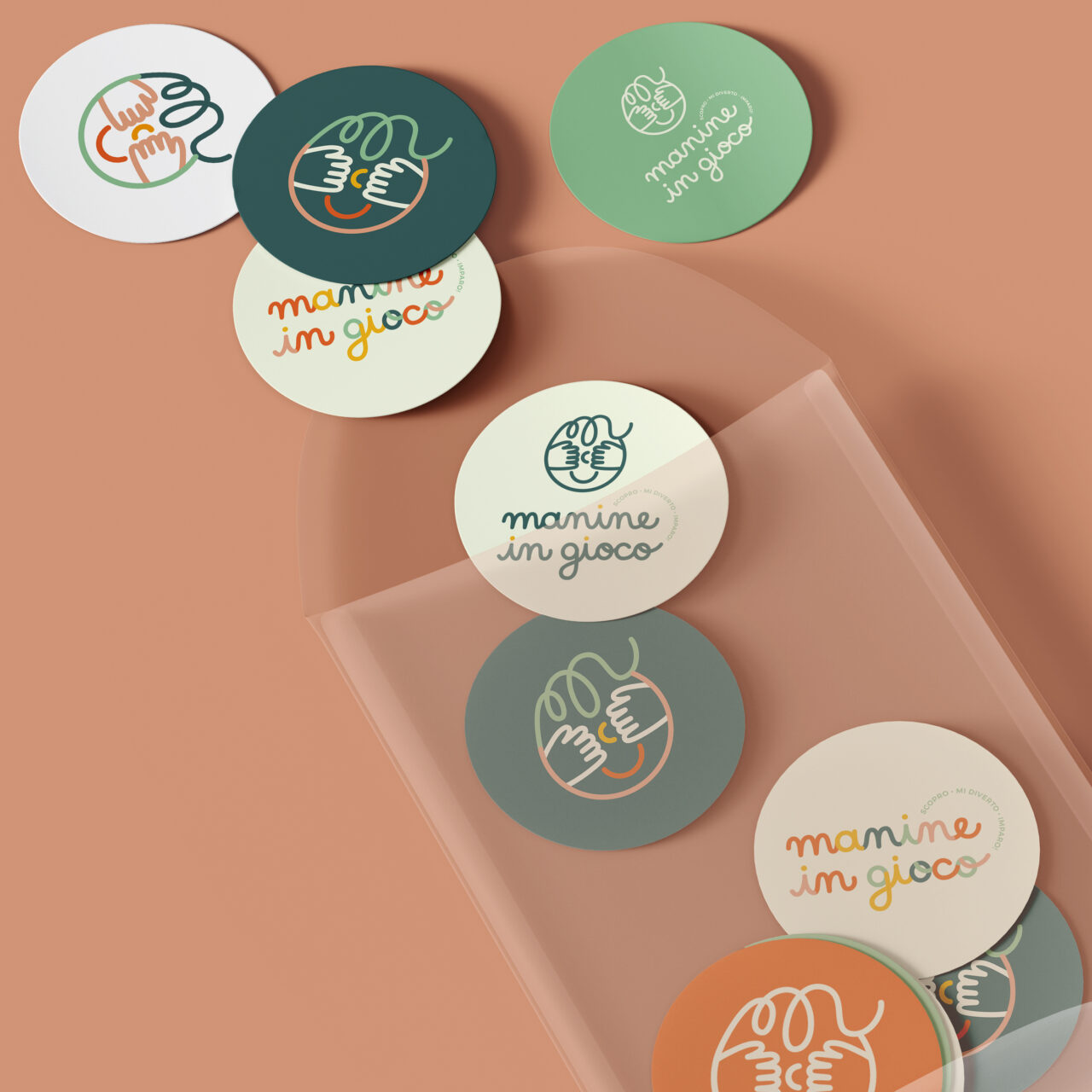
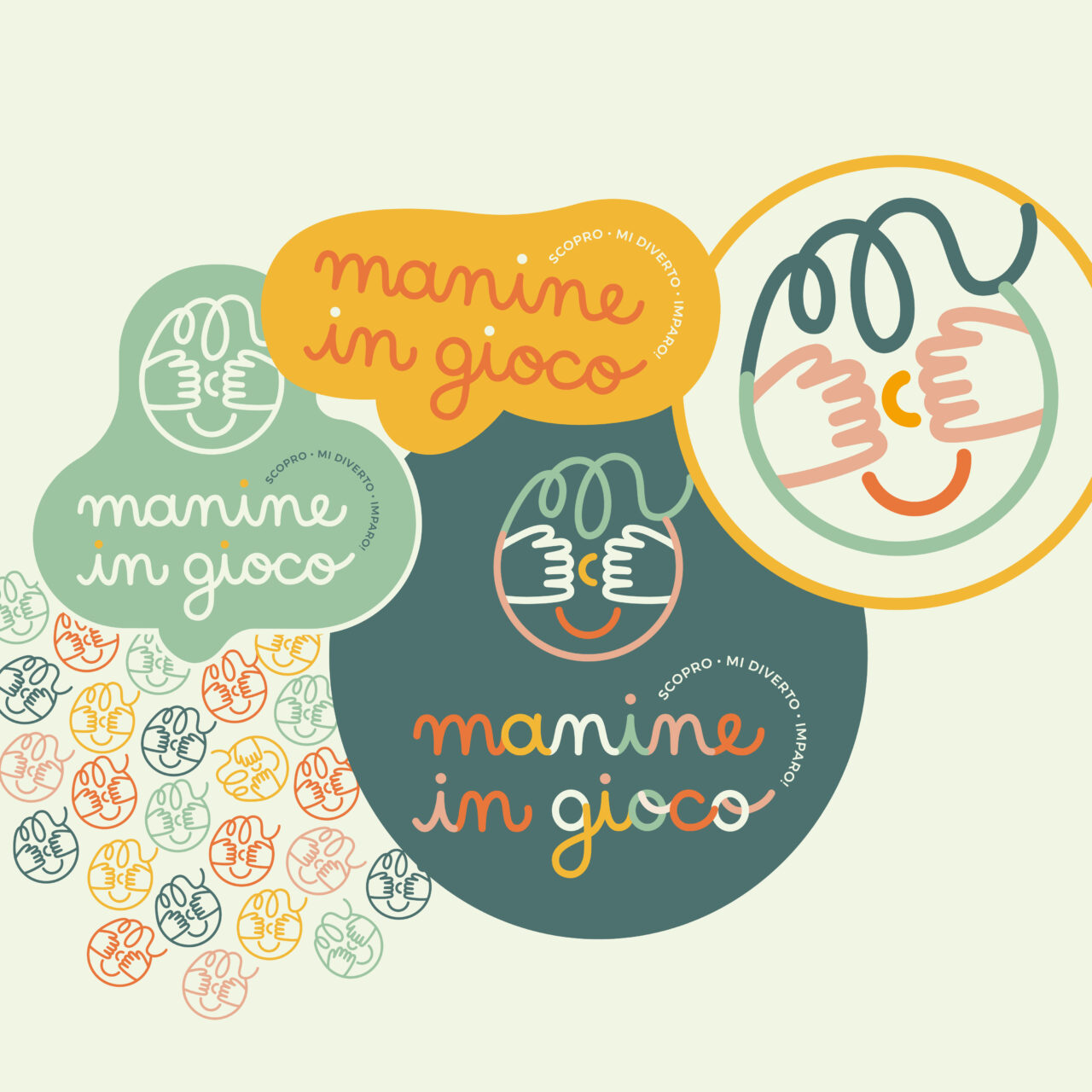
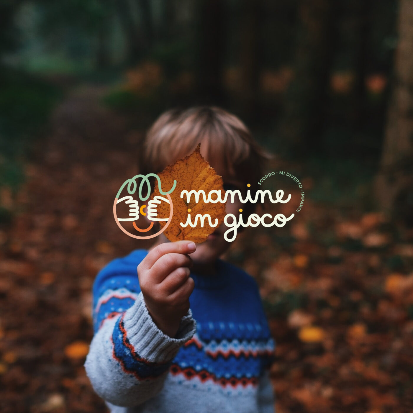
Logo and brand identity for a new children's online store
"Have you ever observed children in their moments of discovery? "The curiosity, the wonder, the engagement, the concentration that bloom in these moments, grant to us viewers the enchantment; time seems to be magically suspended."
Manine in Gioco aspires to be more than just a toy store. The aim is to create a hub where people can exchange innovative tools and ideas.
The e-commerce platform offers a wide range of educational materials, toys, children’s books, and reference books. Each brand is meticulously chosen to guarantee the highest standards.
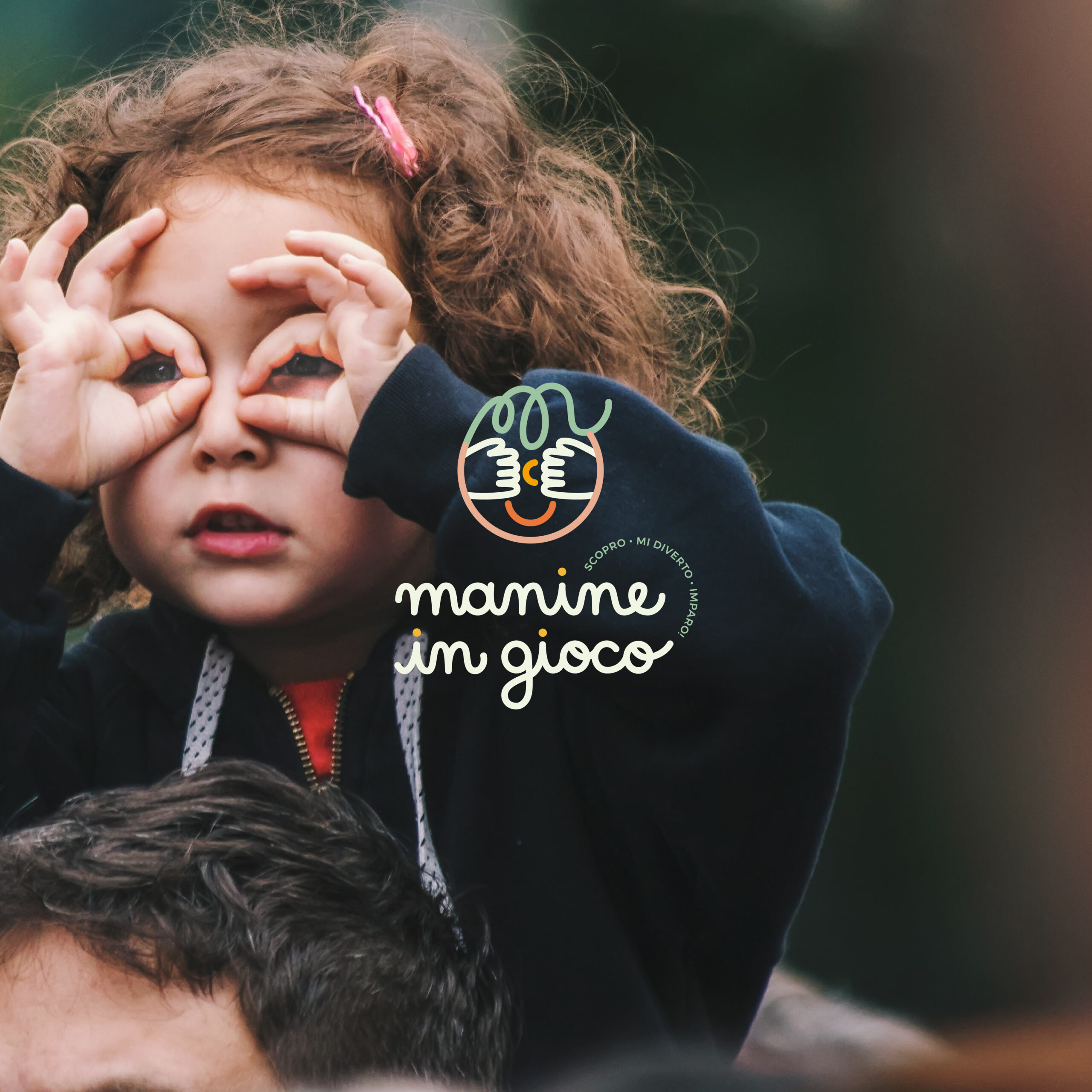
During the brand identity study of Manine in Gioco, it was essential to communicate these values. The logo needed to embody a space where one could find kindness, care, quality, but also playfulness and fun!
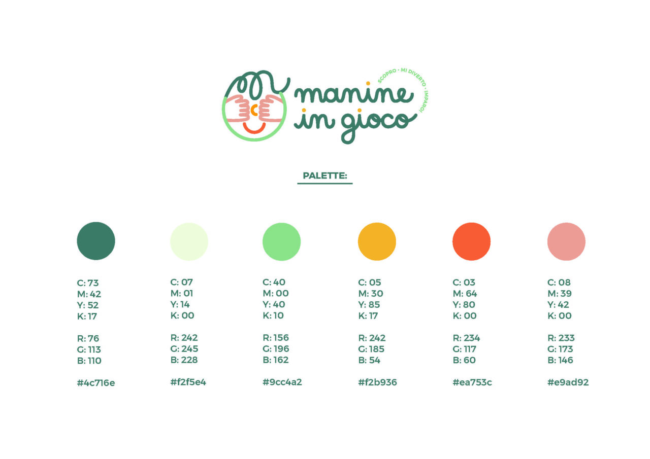
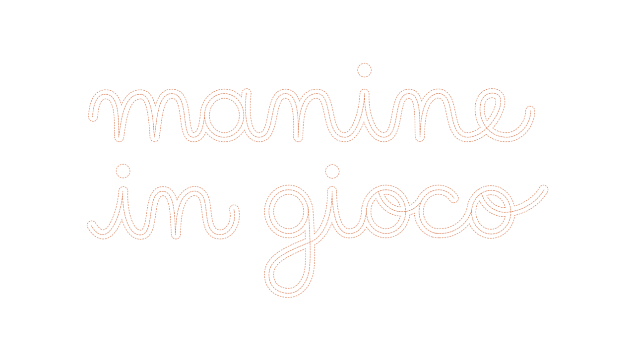
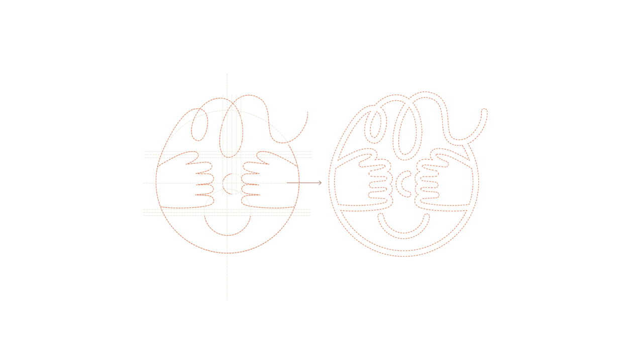
Every aspect, from the color palette to the personalized typography and icon, were thoroughly studied to be beautiful, elegant, and well-crafted, just like the spirit of this store.
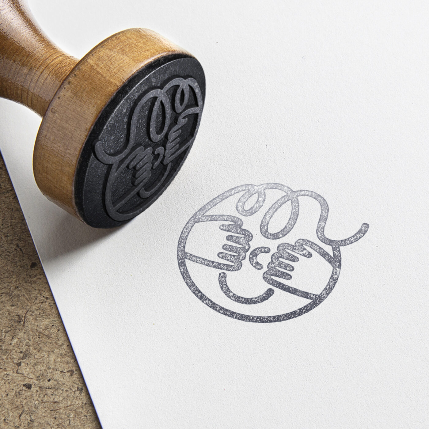
"Why Manine in Gioco? Because it is specifically through their hands that children experience and bring to life their feelings, learnings, understandings, and explorations... Hands serve as the primary pathway to actively comprehend and engage with the world."
Lettering and graphic design: Maria Marega Customer: Manine in Gioco Year: 2022
#branding #graphicdesign #packaging
La collina dorata
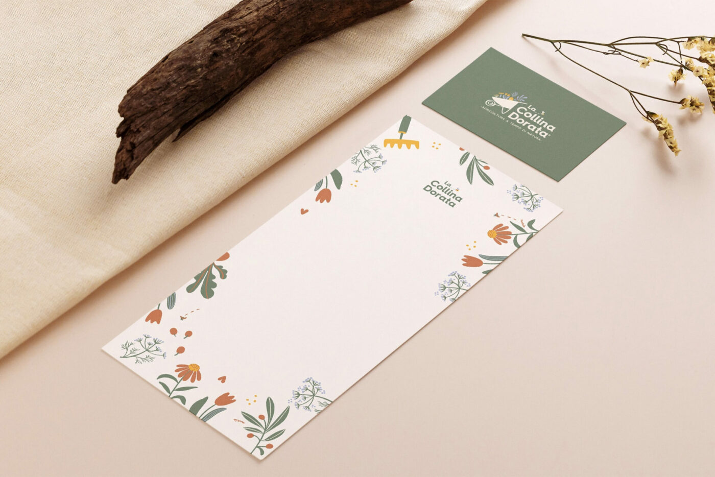
Brand identity for the new Market Garden
"Is it possible to create a small-scale business model that is fair for the people and sustainable for the environment?"
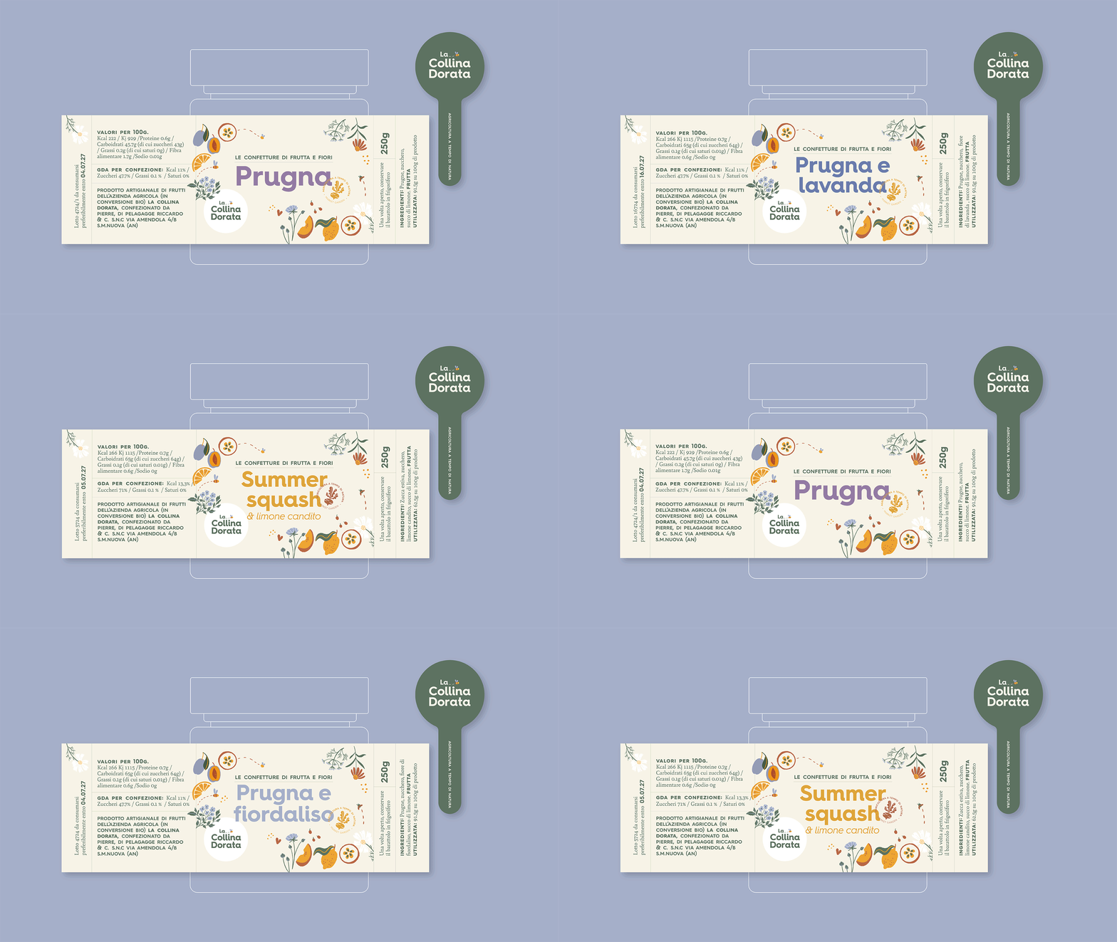
La Collina Dorata is a Market Garden project in the Marche Italian Region where production is focused on seasonal, regenerative, and organic methods.
In 2022, the Italian-English family consisting of Owen, Eleonora, little Aurelio, along with their dog Ralph, left the United Kingdom to realize their dream in Italy: to offer good and environmentally friendly food, thanks to slow and conscious cultivation.
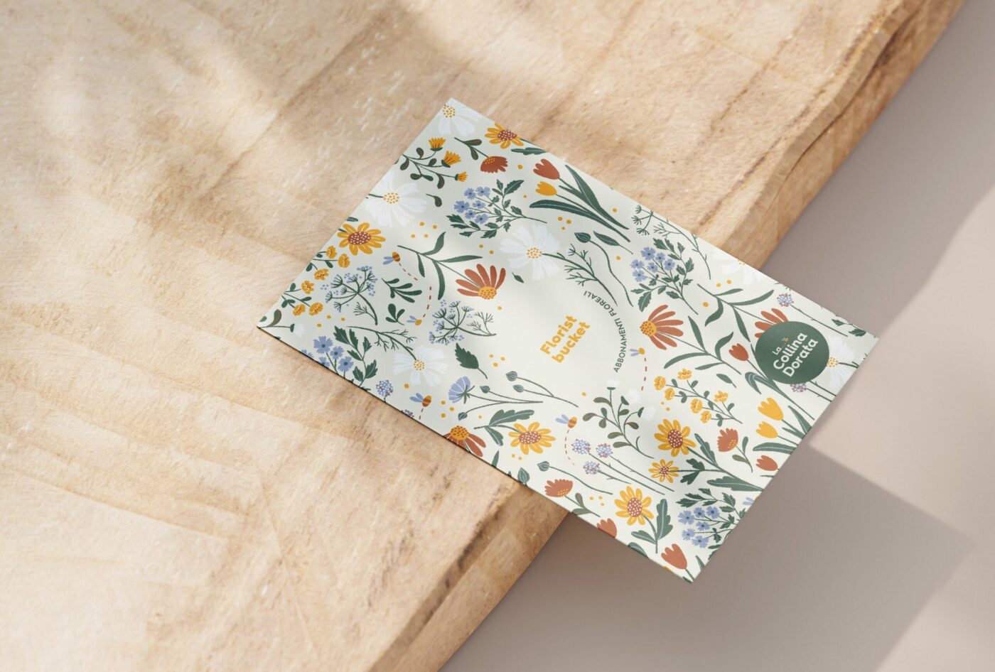
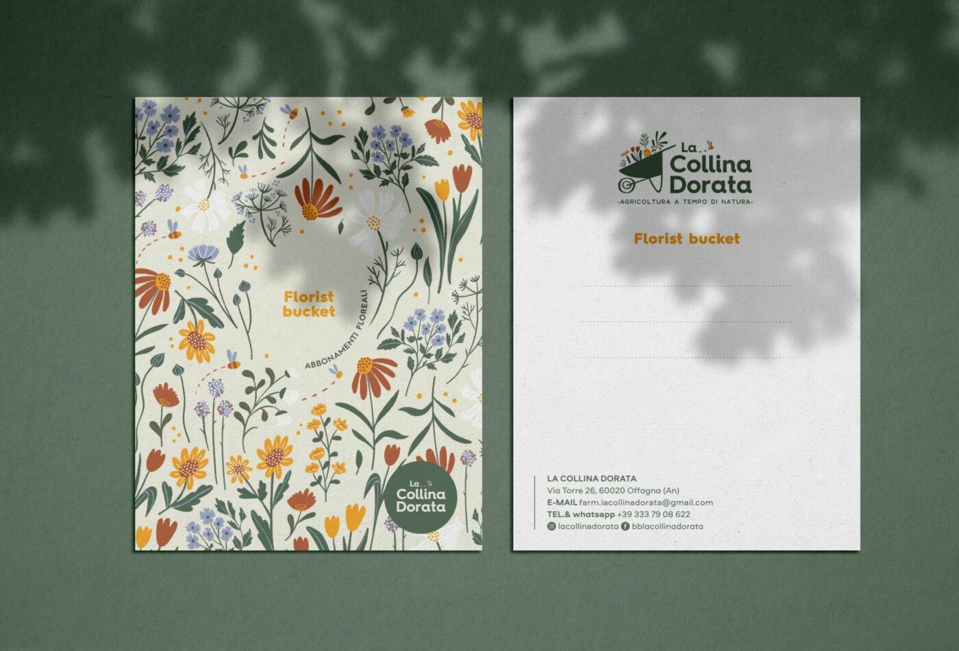
In their flourishing garden, flowers grow abundantly, taking their time to develop, while also offering a sensory experience that heals the soul.
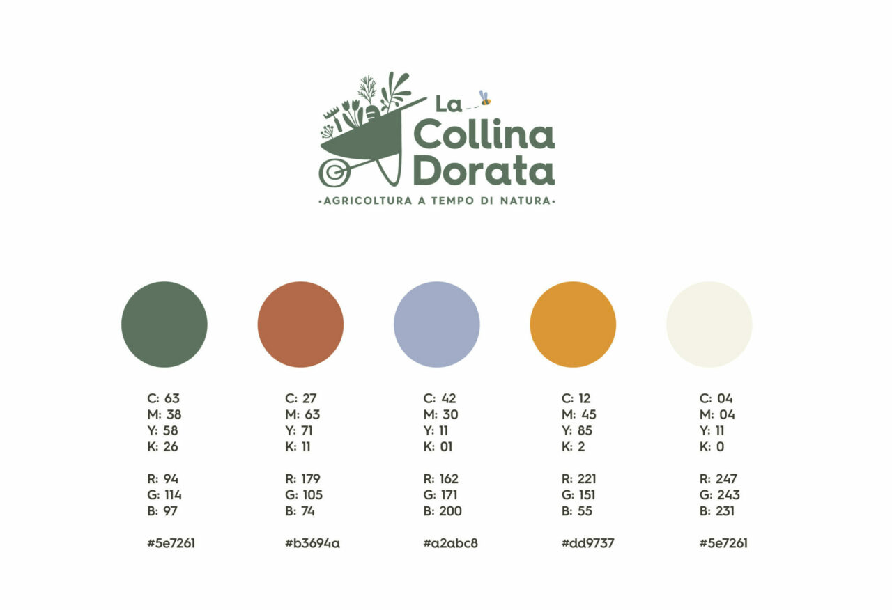
A strong brand identity has been developed to embody the company’s core values:
living slowly in contact with nature
manual work that requires care and attention
love for the territory and biodiversity
hospitality and genuineness in relationship with people
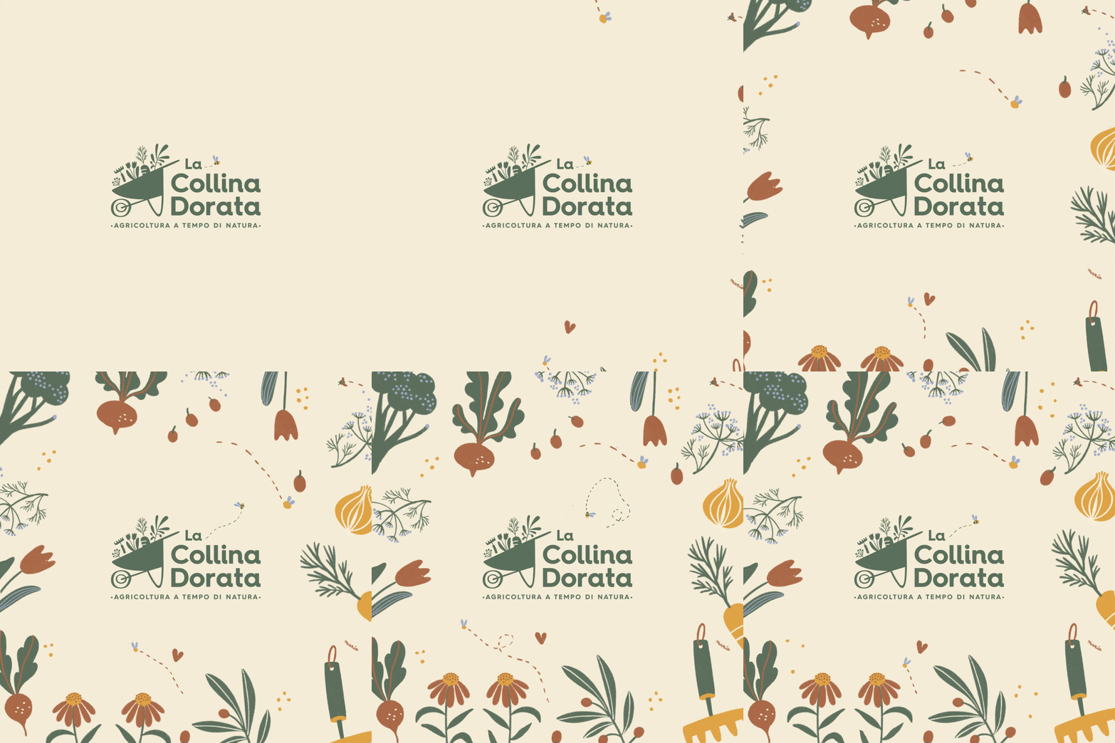
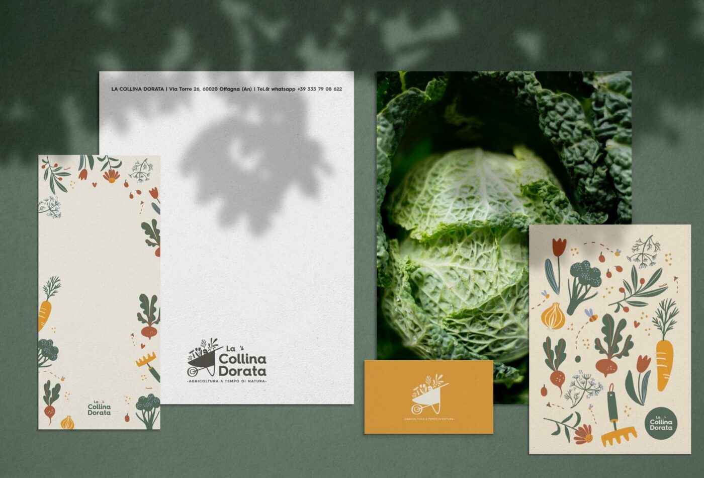
Every element of the visual identity aims to be a reminder of the beauty of outdoor life, attention to detail, and the passion for doing the work one loves
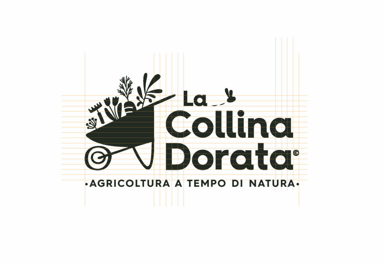
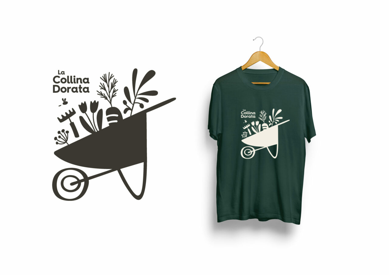
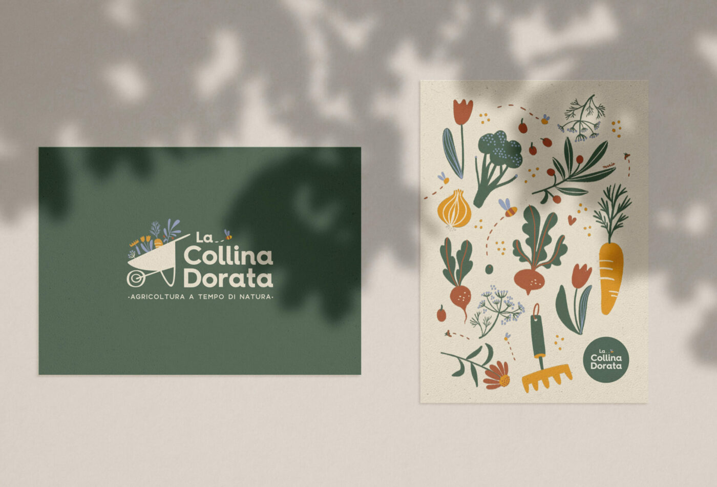
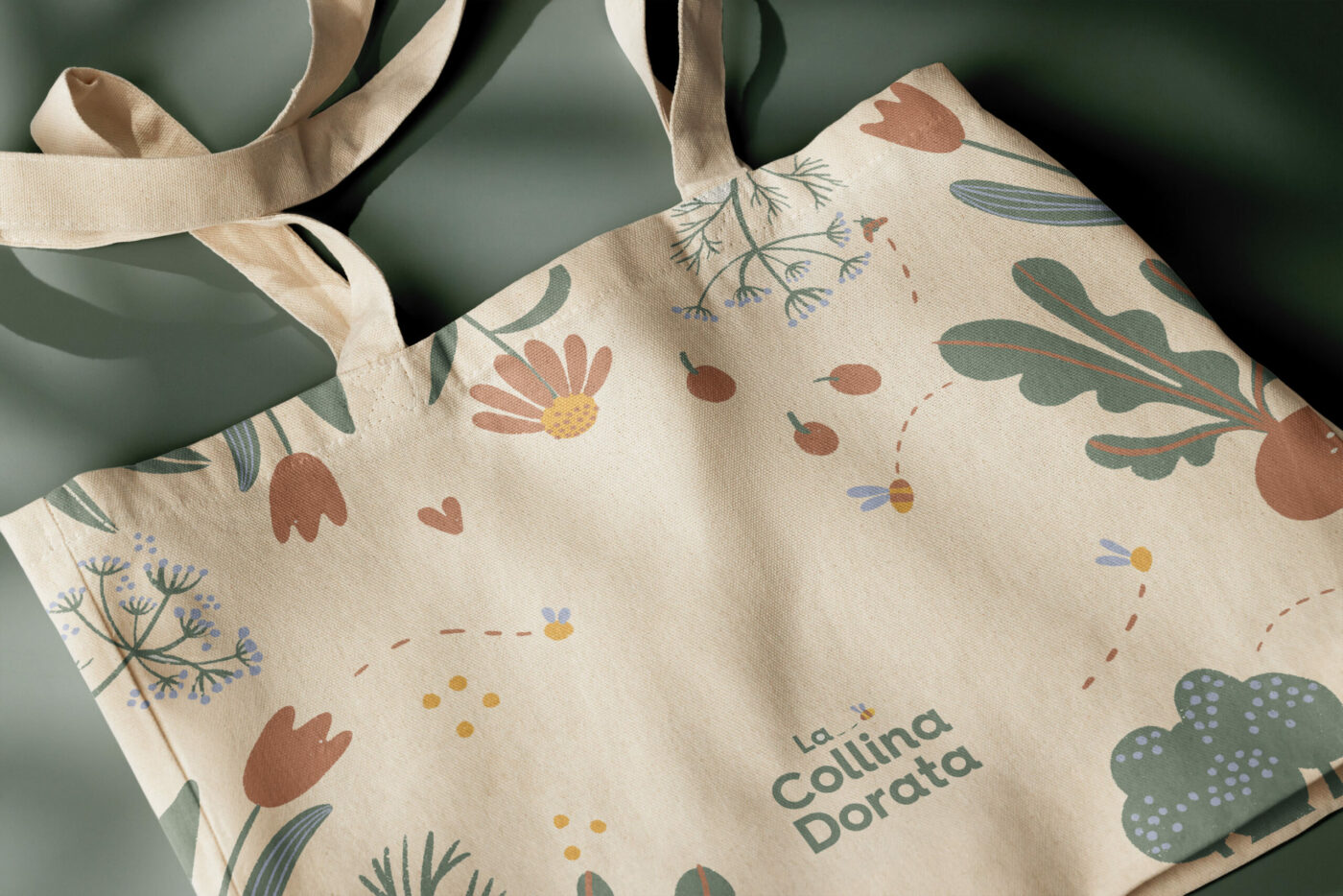
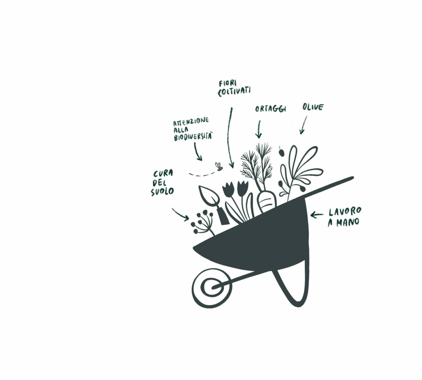
The illustrated icon is composed of 5 elements that represent the types of cultivation in LaCollina Dorata and the wildest part of the territory that surrounds them: cultivated flowers, vegetables, olives, local flora and fauna.
Graphic Design: Maria Marega Customer: La Collina Dorata Year: 2022/2024