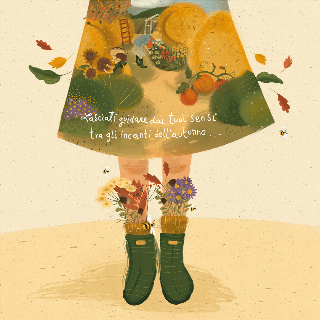
"Let your senses guide you through the Enchantments of Autumn"
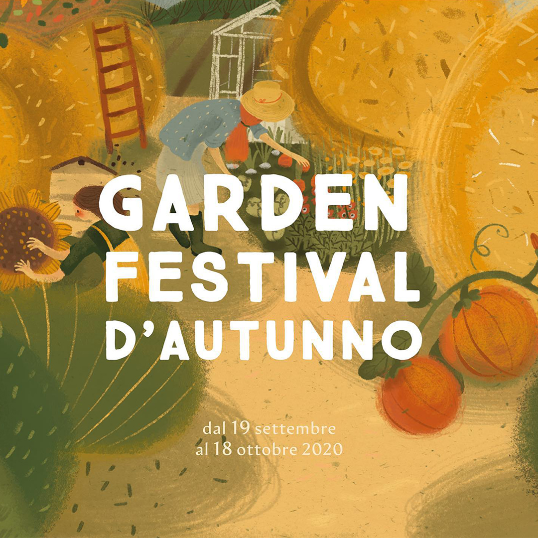
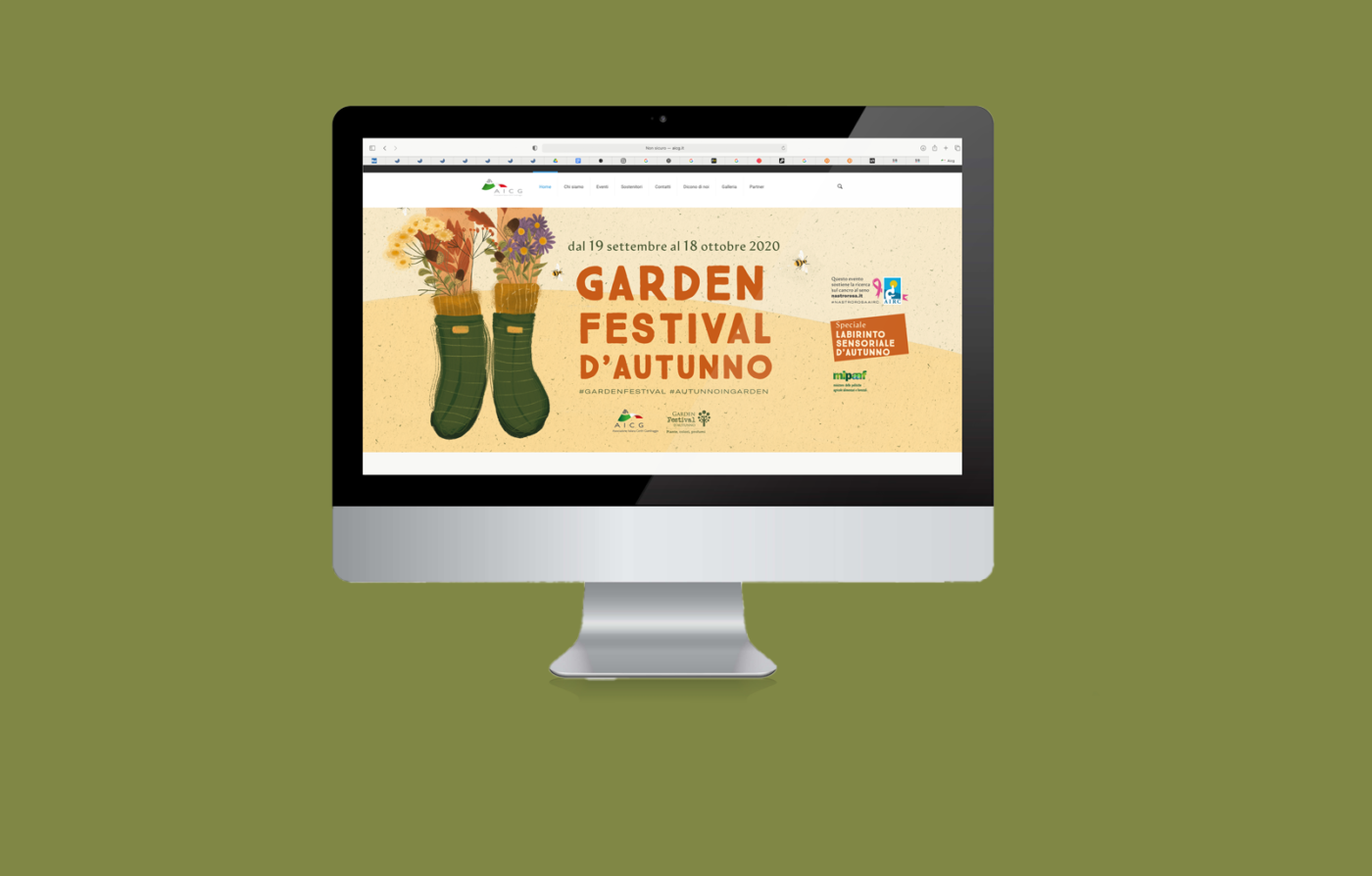
The Autumn Garden Festival is a yearly festival organised by the AICG Gardening Centres all around Italy with the patronage of the Ministry of Agricultural, Food and Forestry Policies.
This event takes place in many Italian Garden Centres, and proposes a different approach to represent and perceive the Autumn season. Focus of the events is hence to describe the Autumn as a time of restart and rebirth, offering different gardening activities.
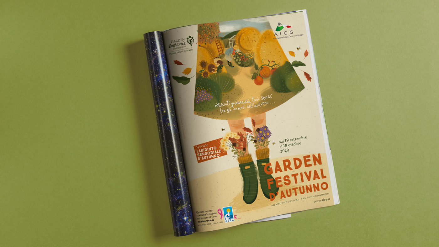
“Let your senses guide you through the Fall Charms” is the slogan at the center of the illustration I created and the main visual concept.
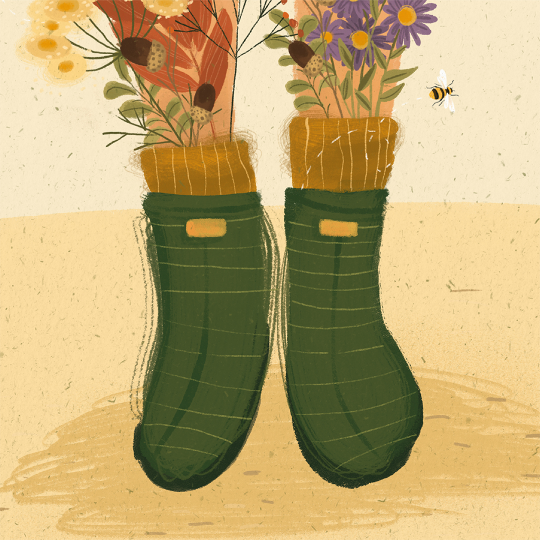
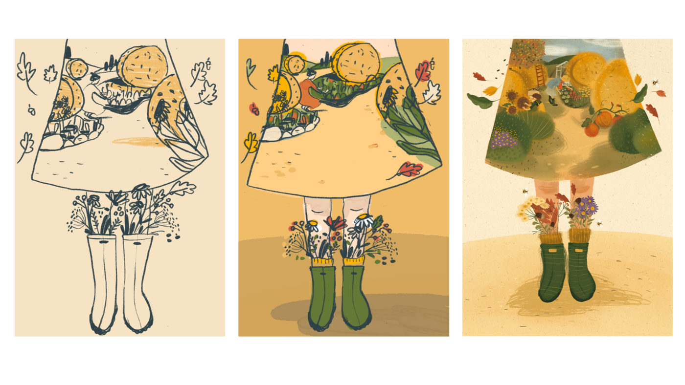
The image is composed by two main layers: in the foreground two boots are worn by a woman and represent the typical blooms of this season. On the upper part, the protagonist’s skirt shows the Autumn outdoor activities.
The visual design aim was to create a very powerful and characteristic image. Shapes and colours were chosen to immediately communicate the Autumn season and the serenity that we live when surrounded by green.
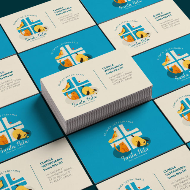
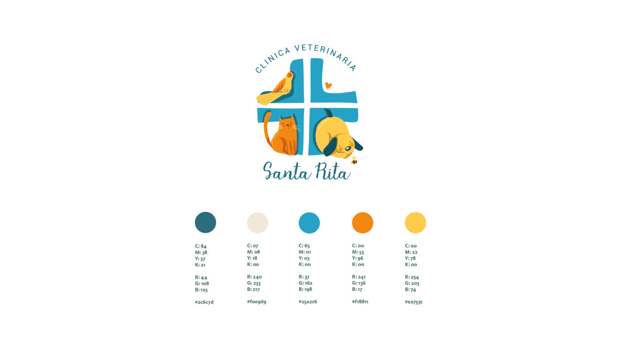
Santa Rita Veterinary Clinic is a veterinary clinic based in Vigonza (Padua, Italy). Their mission is to welcome and take care of pets by adopting advanced medical treatments.
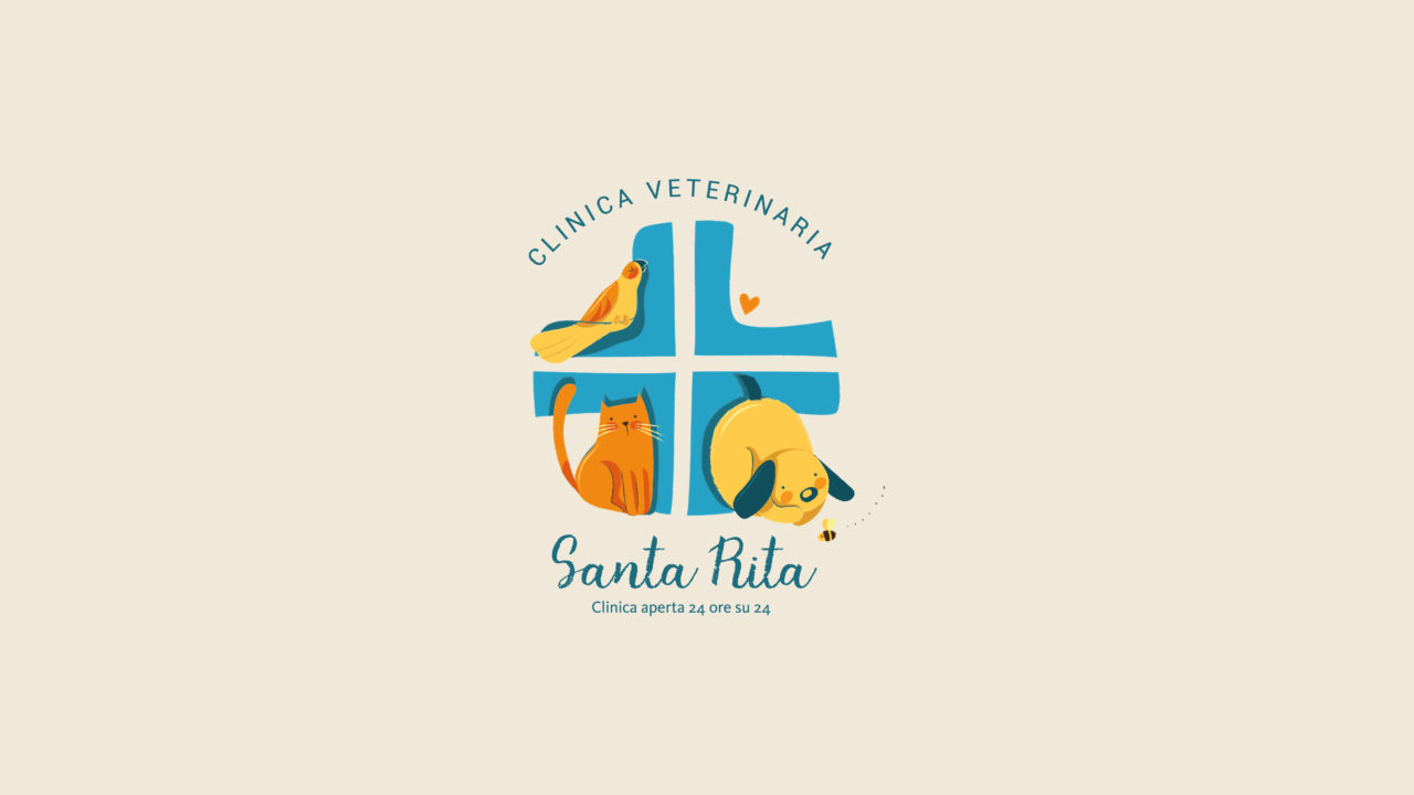
The aim of the project was to develop a new illustrated logo, which might not be recognised as the classic “medical world” or “health veterinary” logo. Therefore, I focused my research on creating a more friendly and emotional illustrated identity which immediately spreads the clinic’s care and hospitality skills.
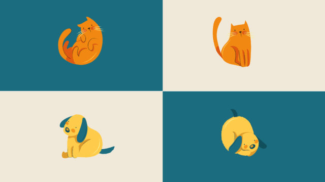
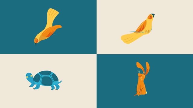
To communicate a family space environment, which was at the same time professional and well structured, I’ve focused on different aspects. First I chose the blue cross: the icon universally used in the veterinary world, to immediately recognise the clinic field. Then I softly shaped it to accomodate some typical clinic’s patients like dogs, cats, but also exotic animals.
Blue is the “key color” which was chosen to trigger a warm palette and strong contrasts. The font was specifically selected to dialogue with the images.
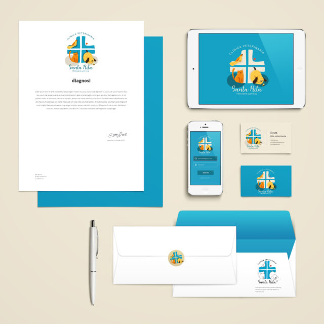
The results was a logo which was declined for all the clinic information medias: brochure, business card, website, social pages but also printed support for window, road signs, and a sticker for the home service cars.
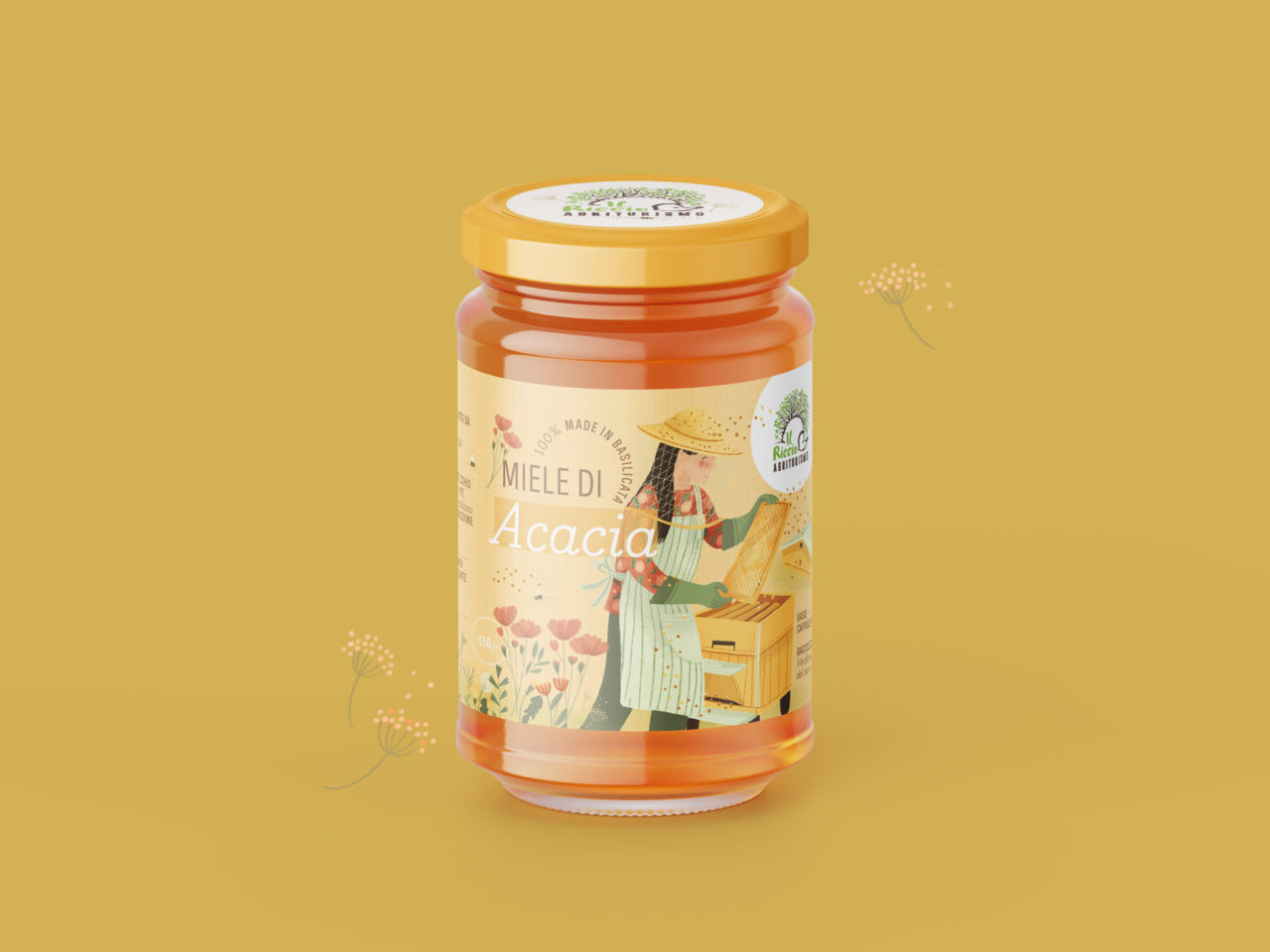
In the Basilicata heart, on a green hill few minutes by Monticchio lakes, Agriturismo Il Riccio offers the opportunity to experience an exciting contact with the surrounding nature.
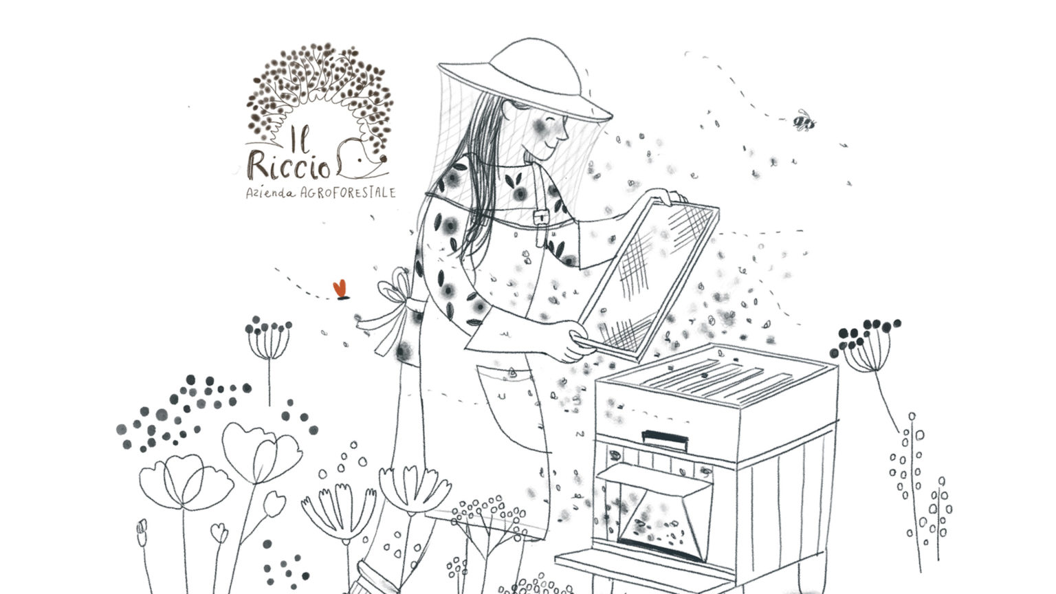
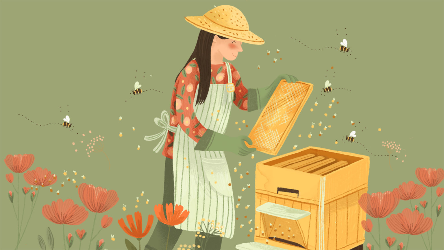
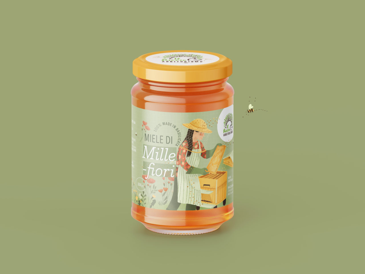
For the family business managed by Antonio and Stefania, I created an illustration dedicated to their farm honey.
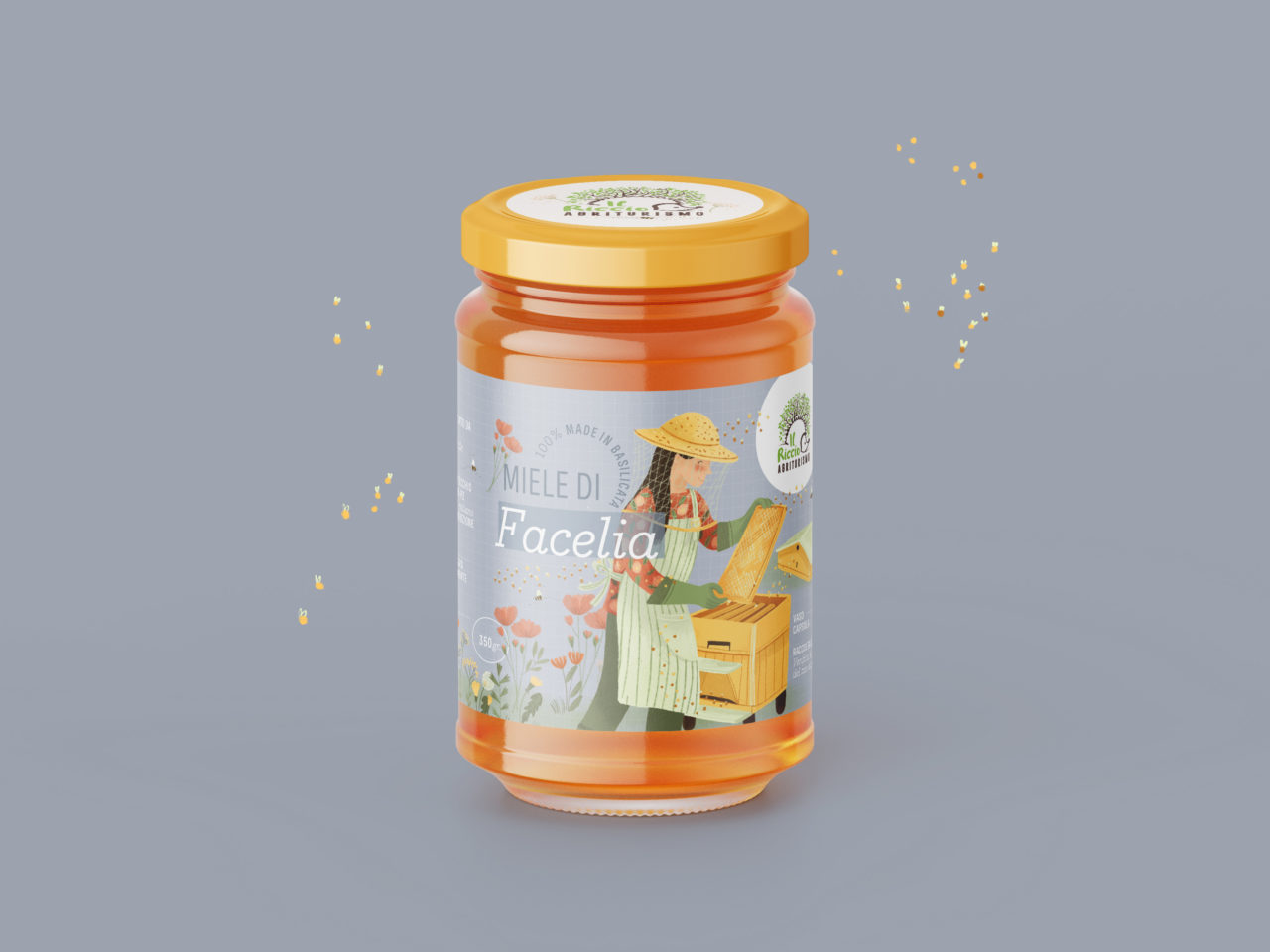
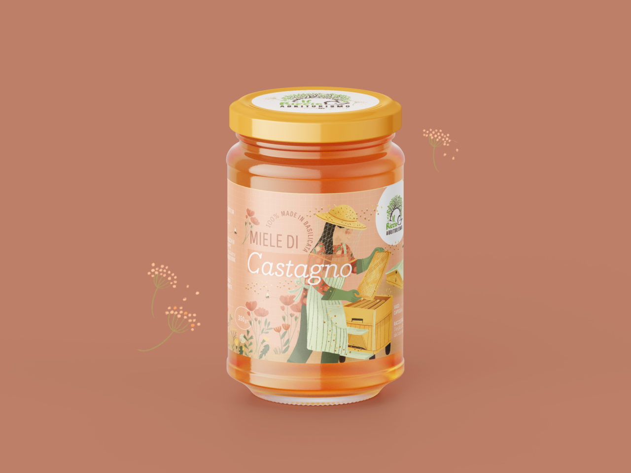
The illustration shows Stefania with her bees and is used as a label on their honey jars. To distinguish their four different honey types (Wildflower, Acacia, Phacelia and Chestnut.), the illustration was adapted changing the background colour.
Illustration and Art direction: Maria Marega Customer: Agriturismo il Riccio Year: 2022
#wedding #graphicdesign #illustration
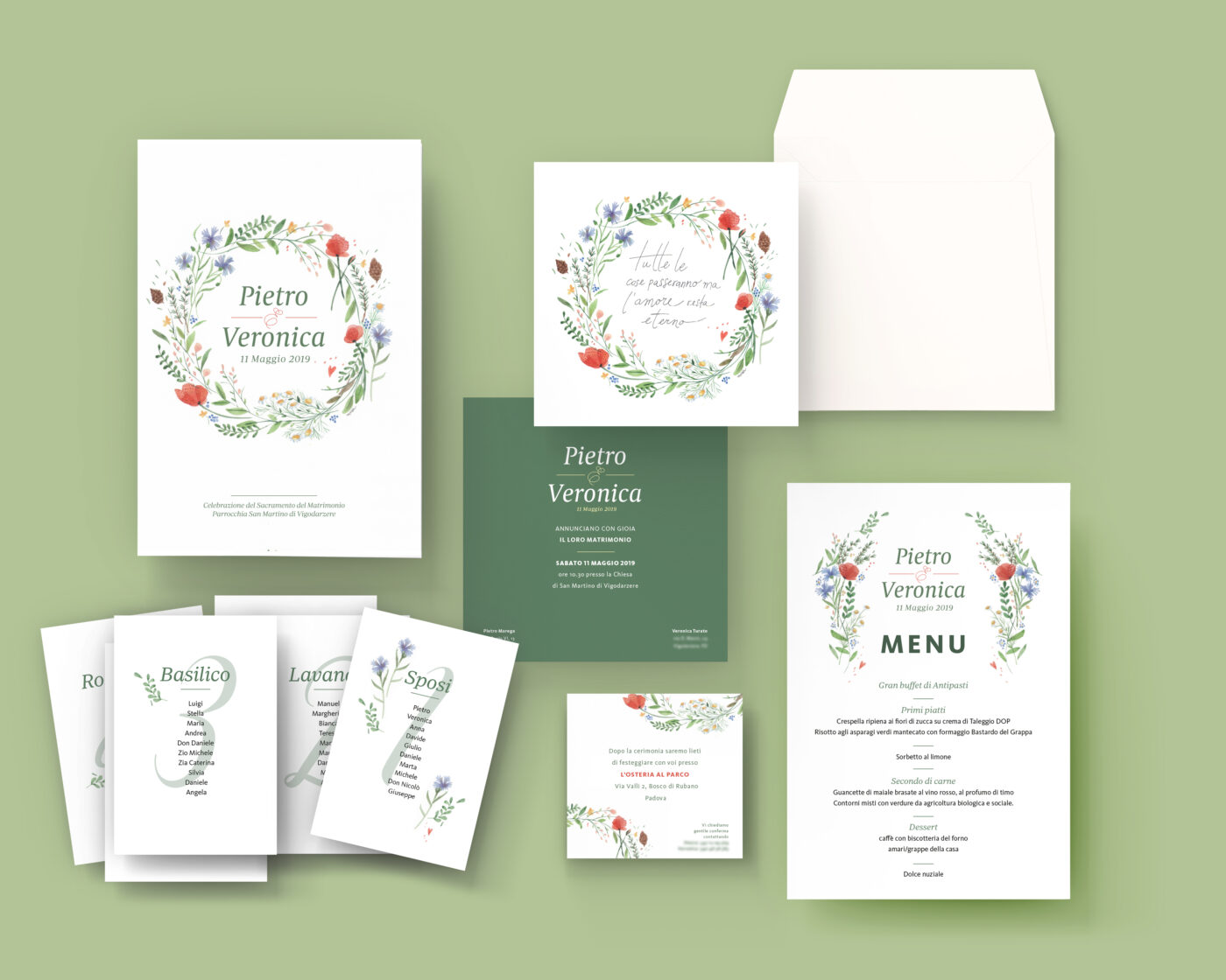
wedding stationary
Graphic designs for your wedding, thoughtfully designed and tailored for you
"Get lost in the details...they are what make every thing unique"
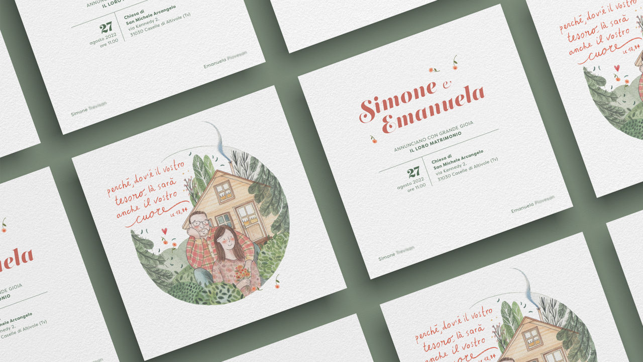
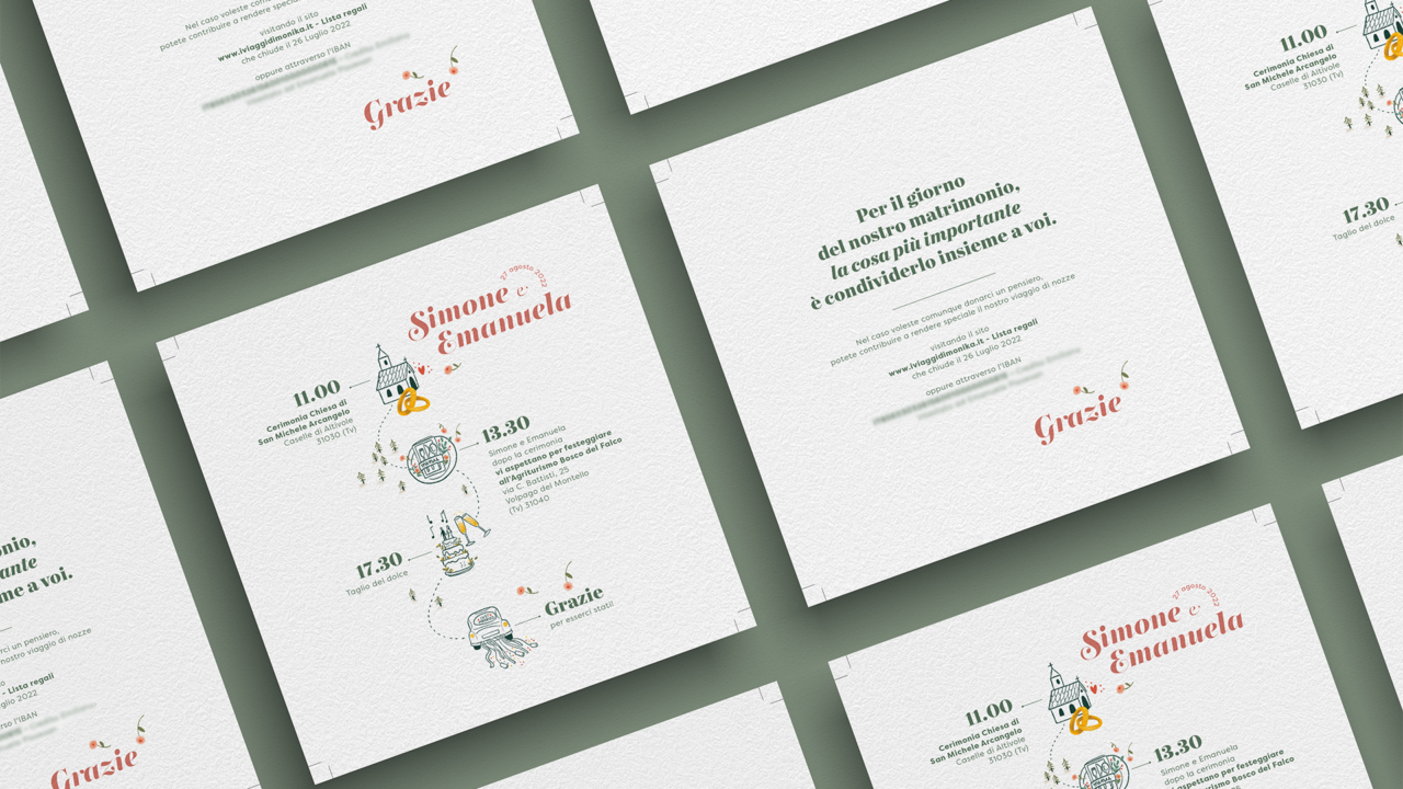
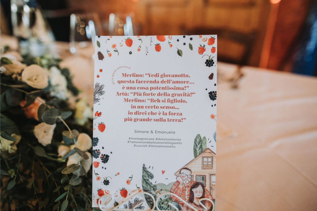
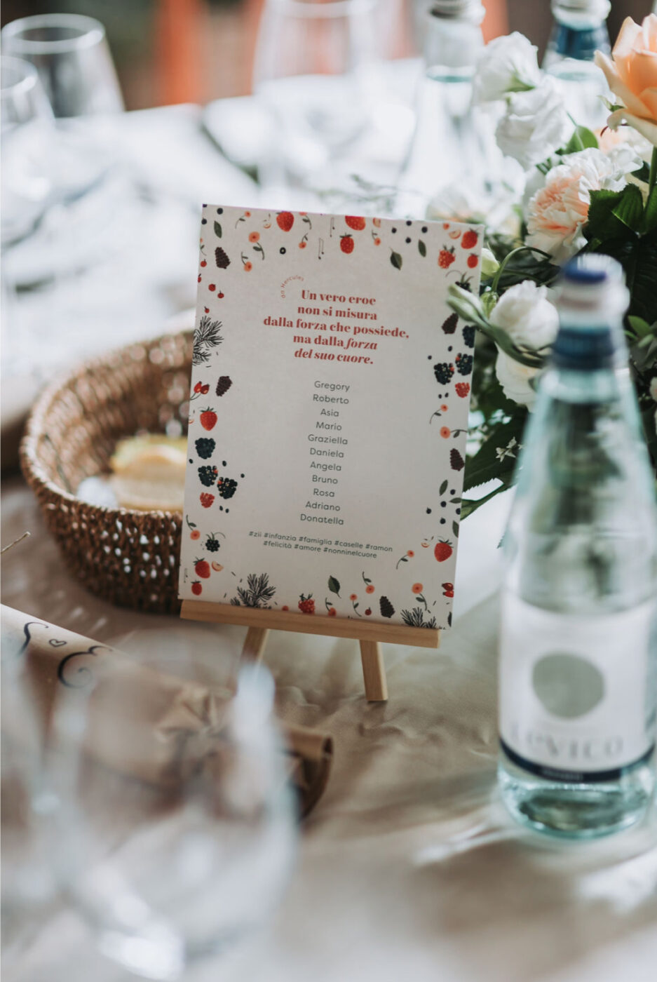
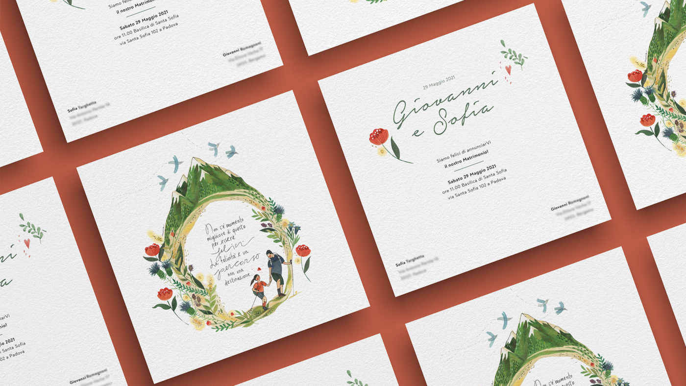
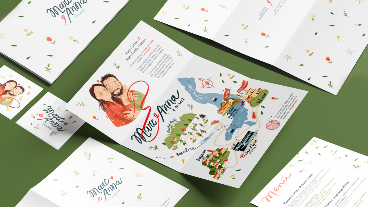
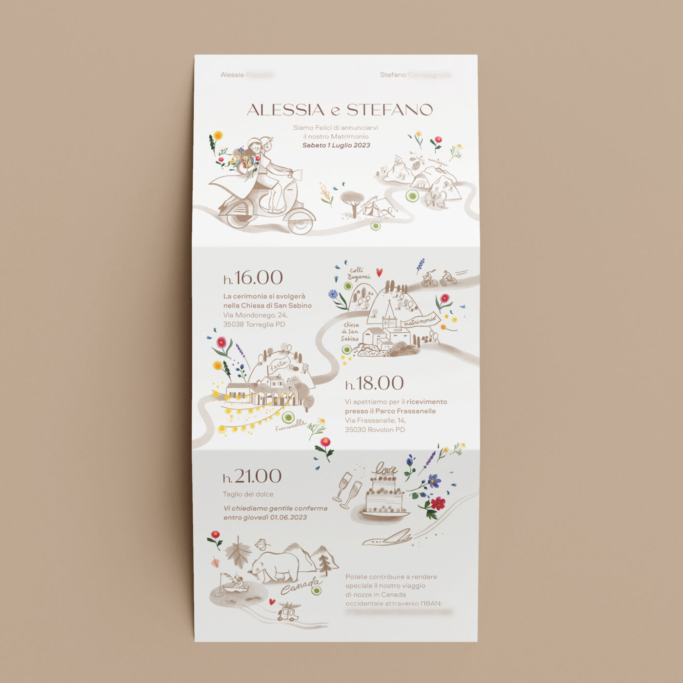
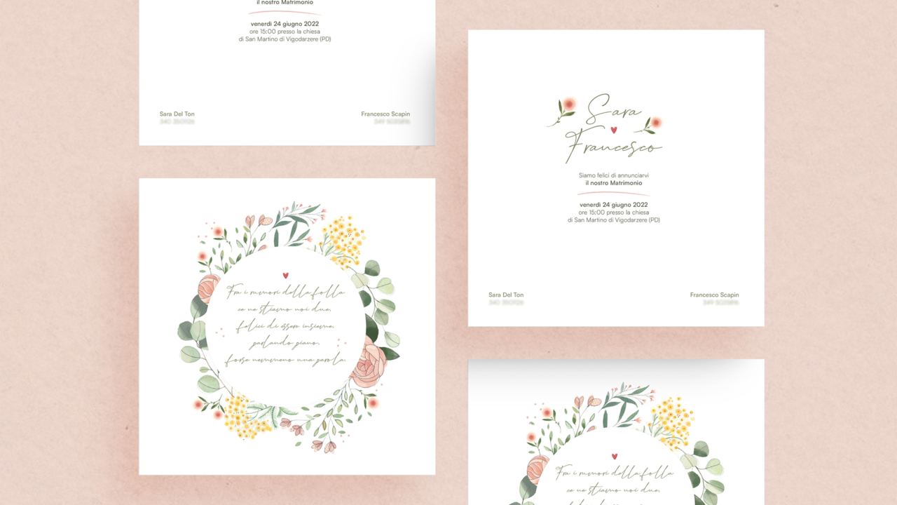
“Wedding stationery” is the term used to indicate the set of paper elements that give a graphic identity to the wedding event.
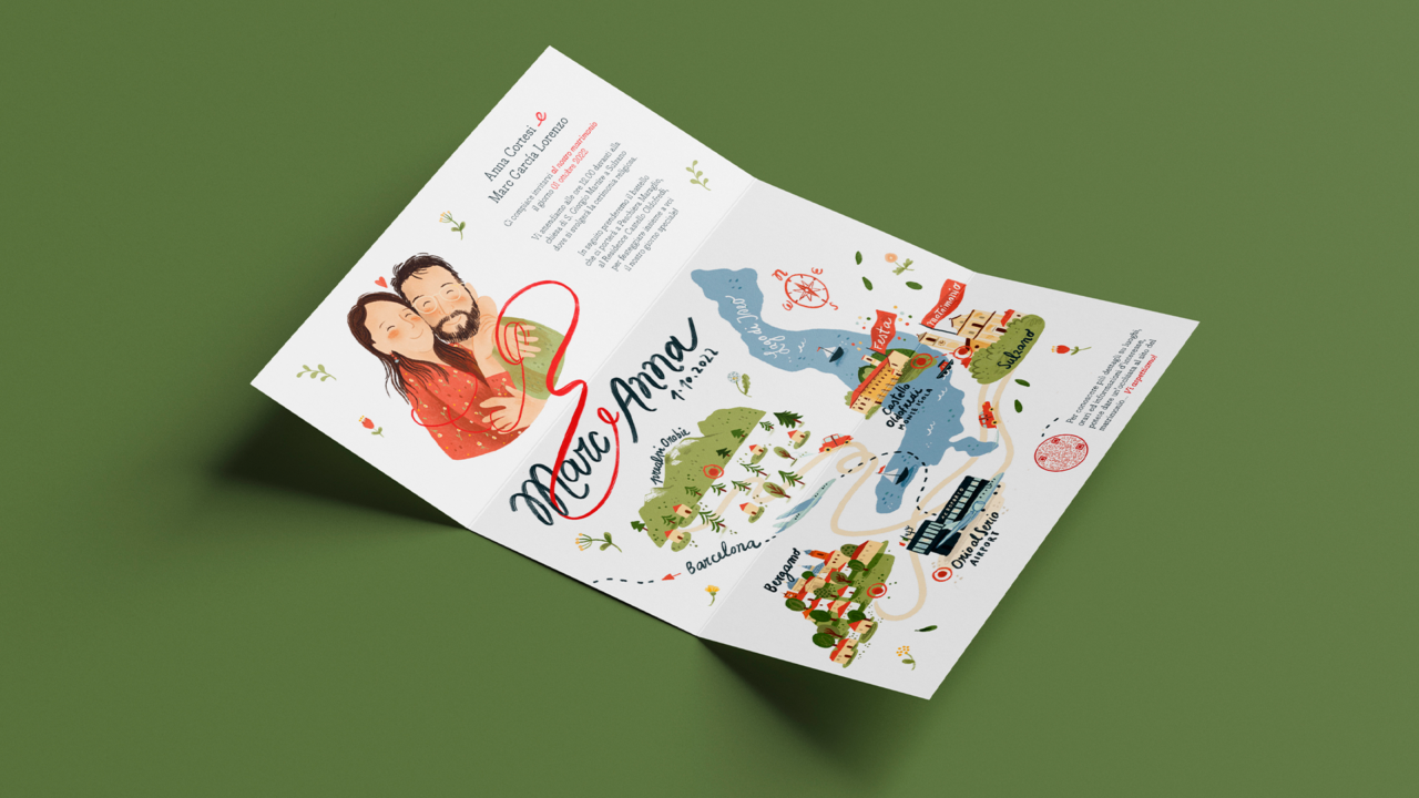
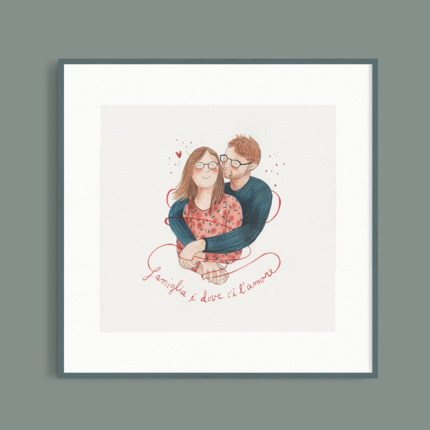
Starting from the wedding invitation, along with the coordinated supports, the chosen style and theme for your special event will be narrated… as well as your love story.
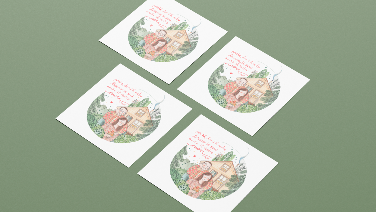
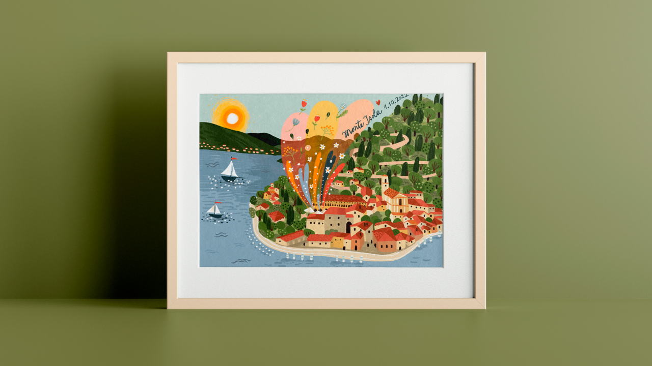
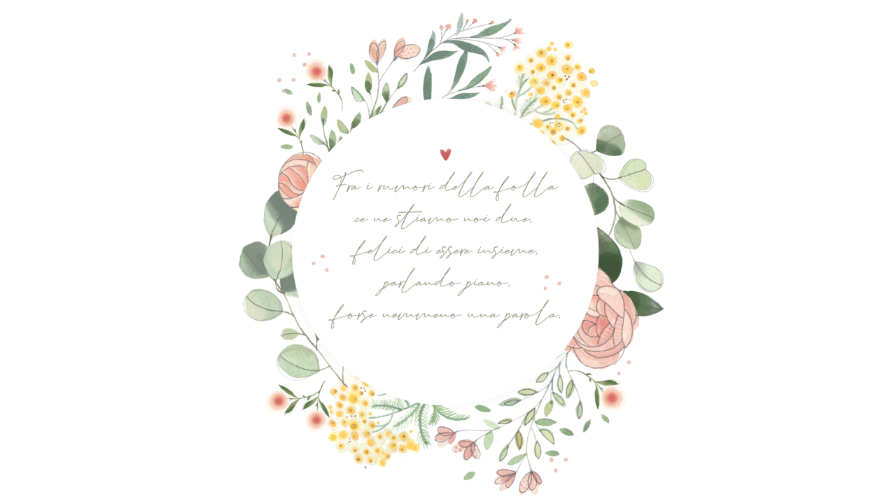
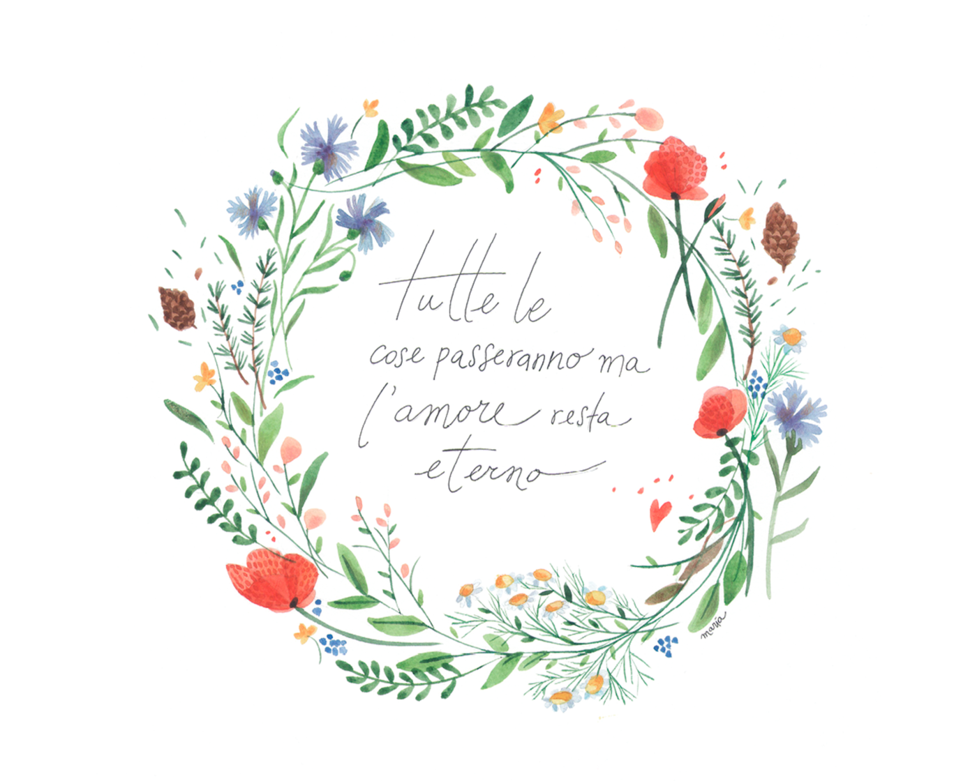
The illustrations designed for you will be present as a common thread in all the details of the event, making it unique and original. You will be guided in the graphic design of your wedding and supported in the final printing phase.
“ Every great wedding starts with a great design”
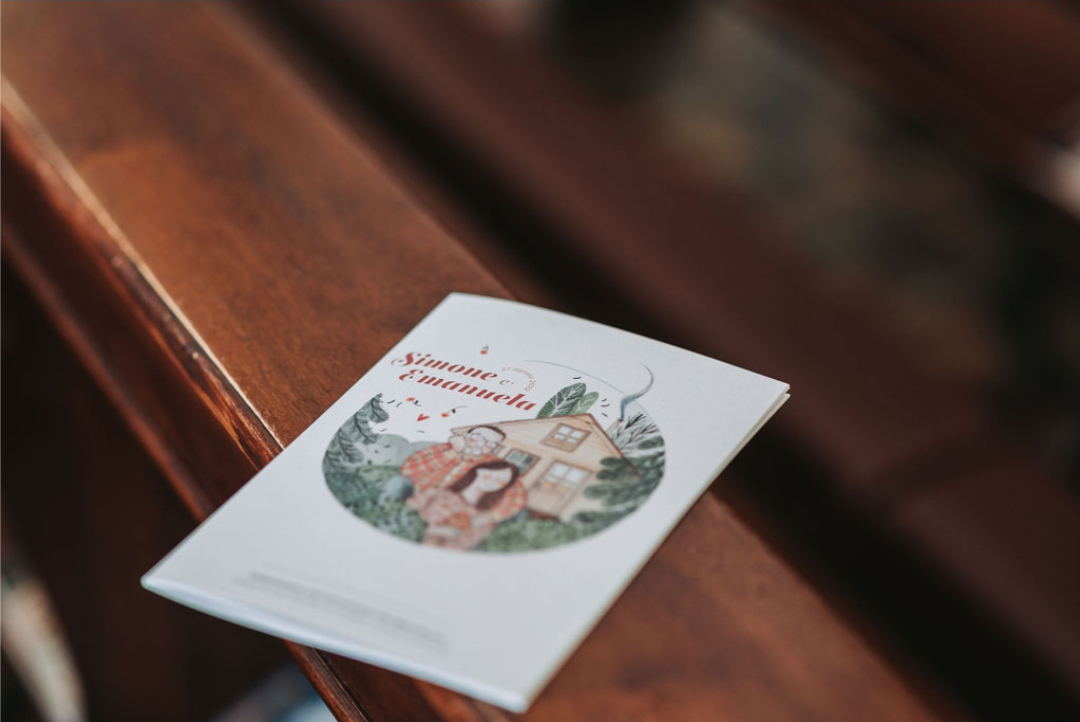
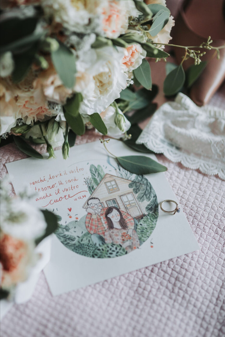
The Wedding invitations is the primary and main craftwork of the entire wedding stationery. The design and choices of this will create all the coordinated supports. The invitation that will be realized for you will be composed of two fundamental components: the graphic layout and the illustration; these will be custom-made and personalized 100% to make the event unique and “truly yours.”
You will be guided step by step towards the choice of solutions that best suit the theme and spaces of your wedding; starting from the most emotional moment: the ceremony.
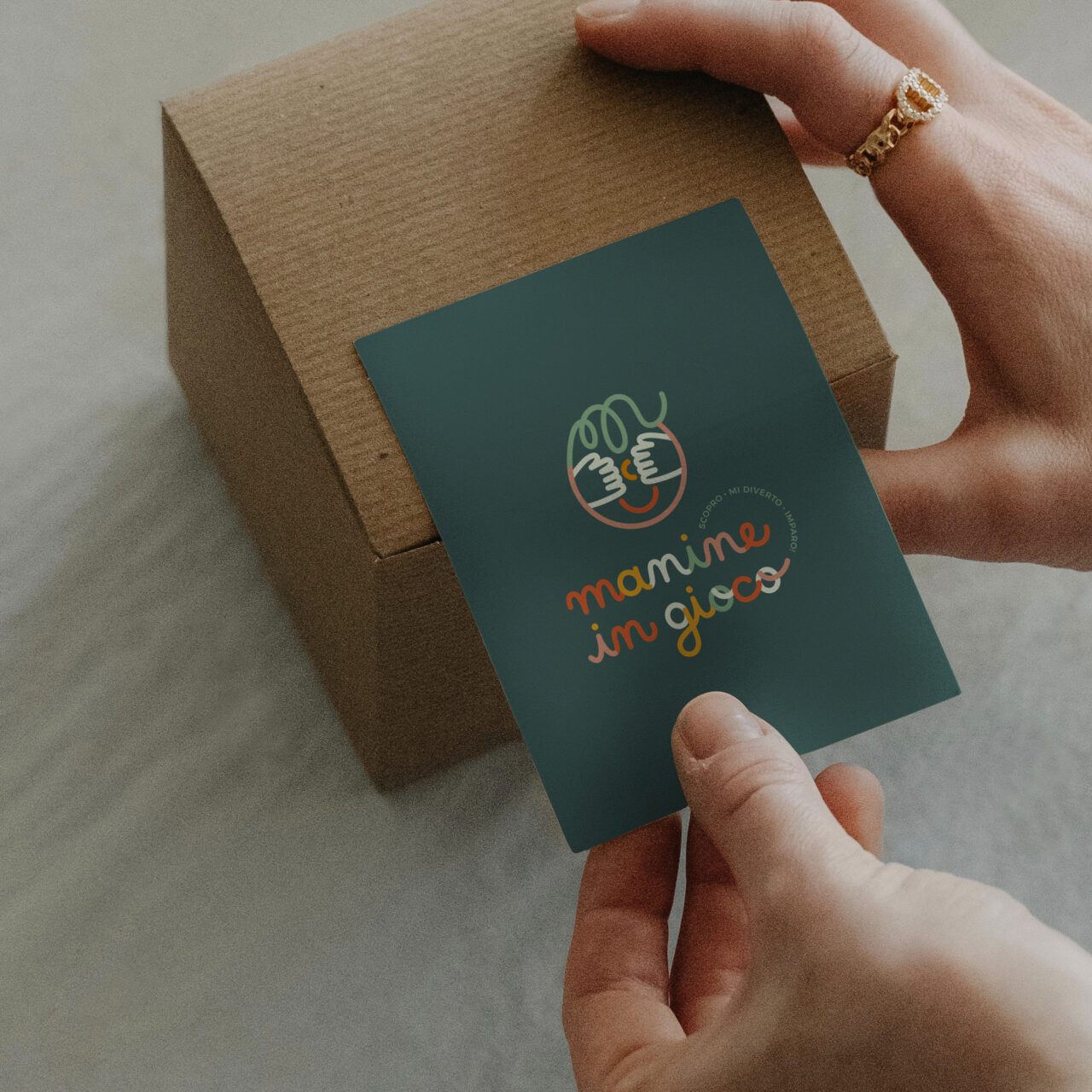
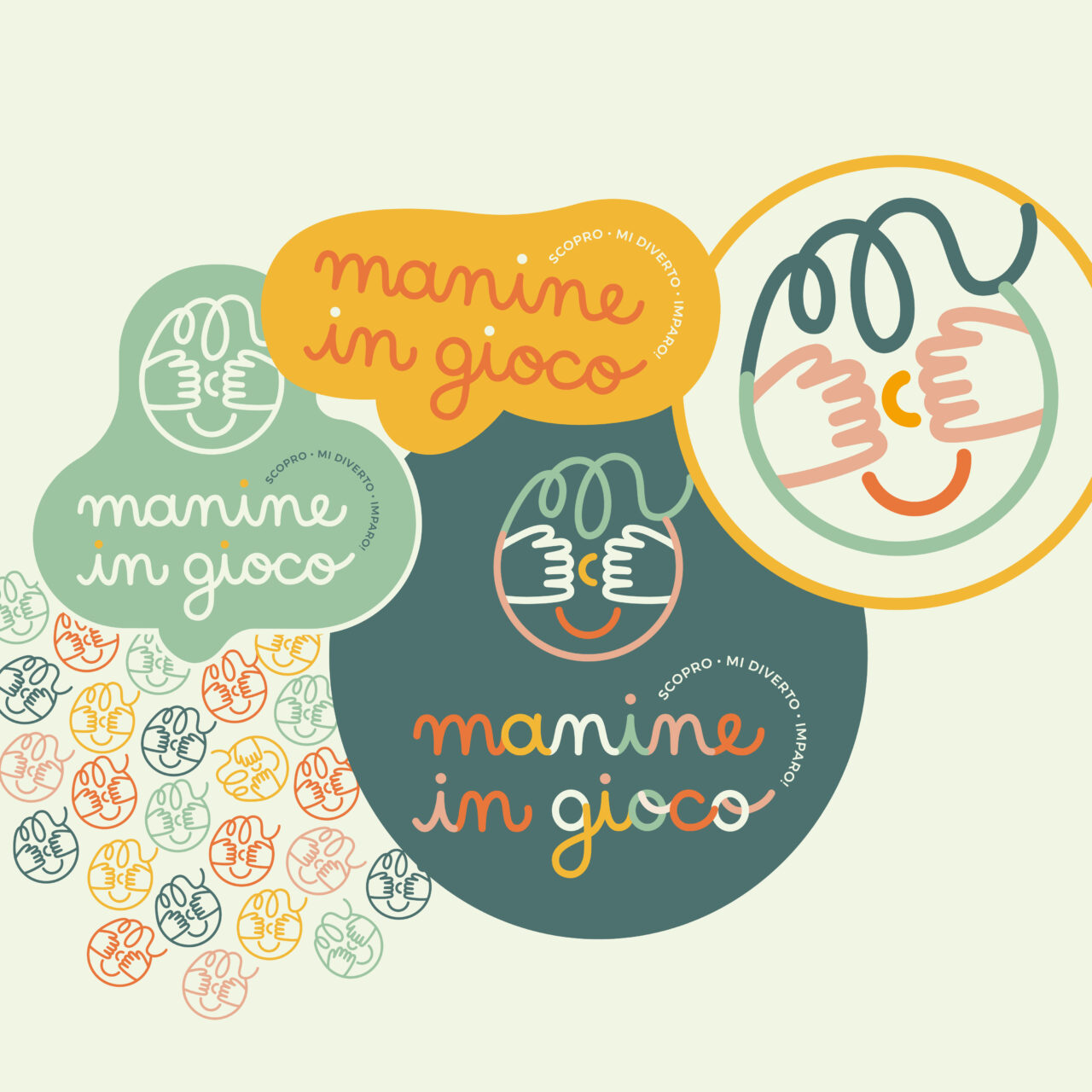
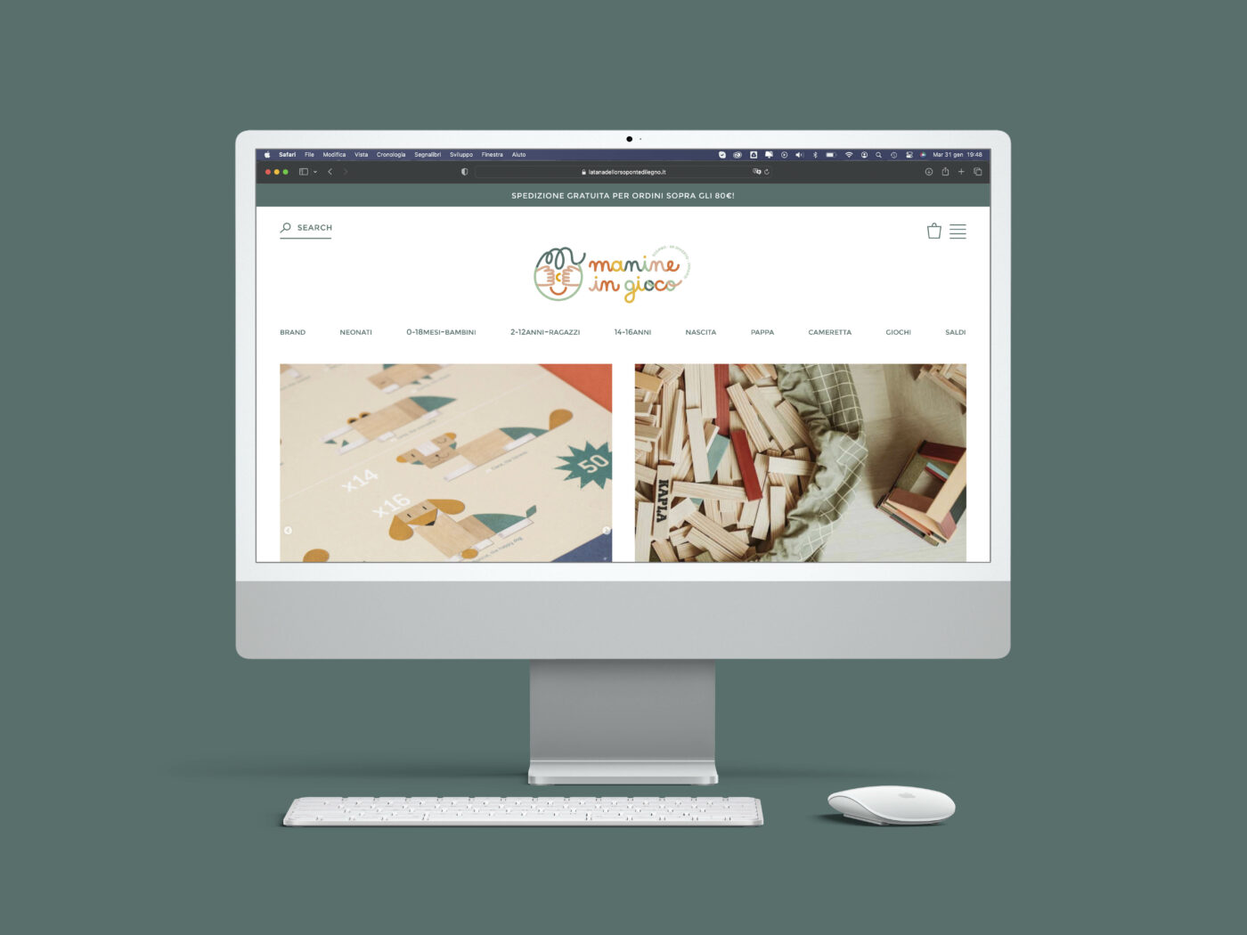
Logo and brand identity for a new children's online store
"Have you ever observed children in their moments of discovery? "The curiosity, the wonder, the engagement, the concentration that bloom in these moments, grant to us viewers the enchantment; time seems to be magically suspended."
Manine in Gioco aspires to be more than just a toy store. The aim is to create a hub where people can exchange innovative tools and ideas.
The e-commerce platform offers a wide range of educational materials, toys, children’s books, and reference books. Each brand is meticulously chosen to guarantee the highest standards.
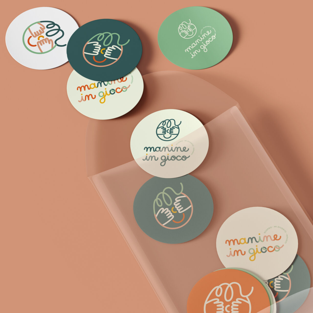
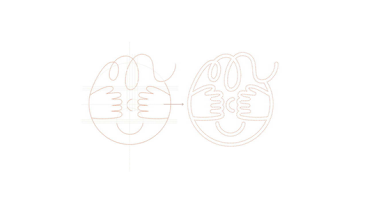
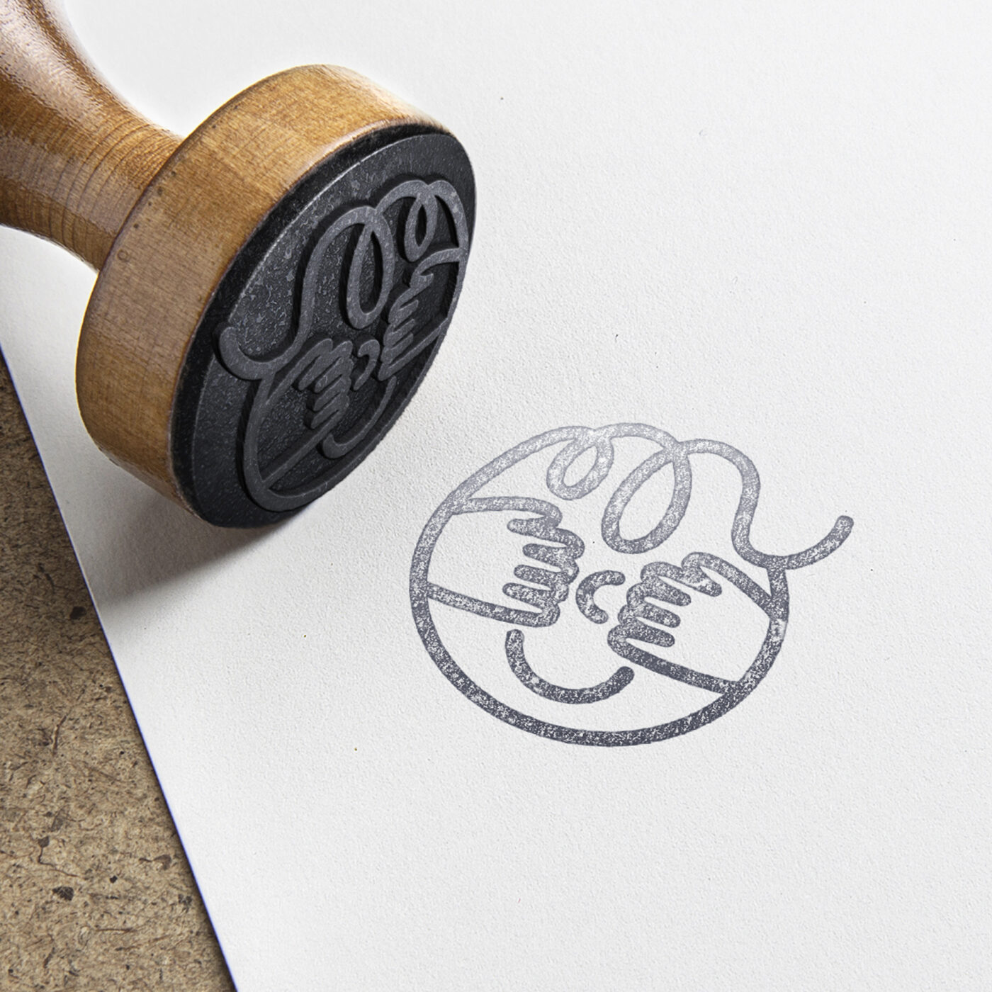
During the brand identity study of Manine in Gioco, it was essential to communicate these values. The logo needed to embody a space where one could find kindness, care, quality, but also playfulness and fun!
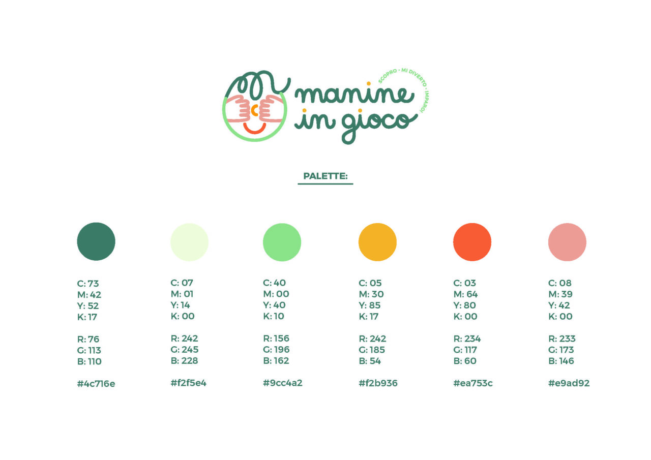
Every aspect, from the color palette to the personalized typography and icon, were thoroughly studied to be beautiful, elegant, and well-crafted, just like the spirit of this store.
"Why Manine in Gioco? Because it is specifically through their hands that children experience and bring to life their feelings, learnings, understandings, and explorations... Hands serve as the primary pathway to actively comprehend and engage with the world."
Lettering and graphic design: Maria Marega Customer: Manine in Gioco Year: 2022
#branding #graphicdesign #packaging
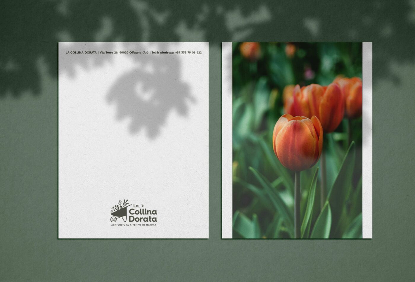
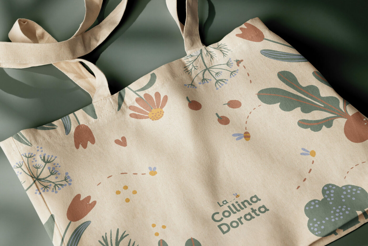
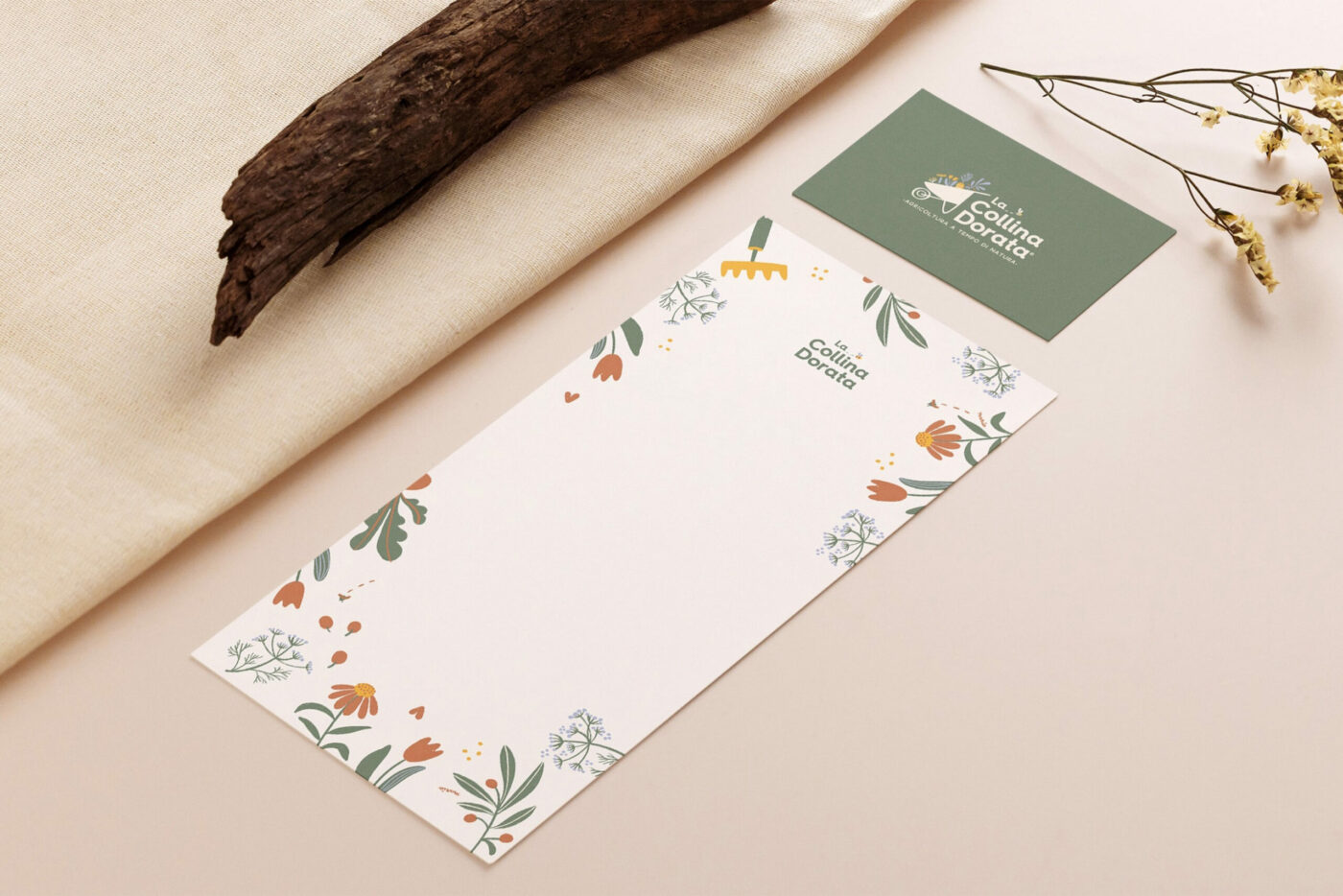
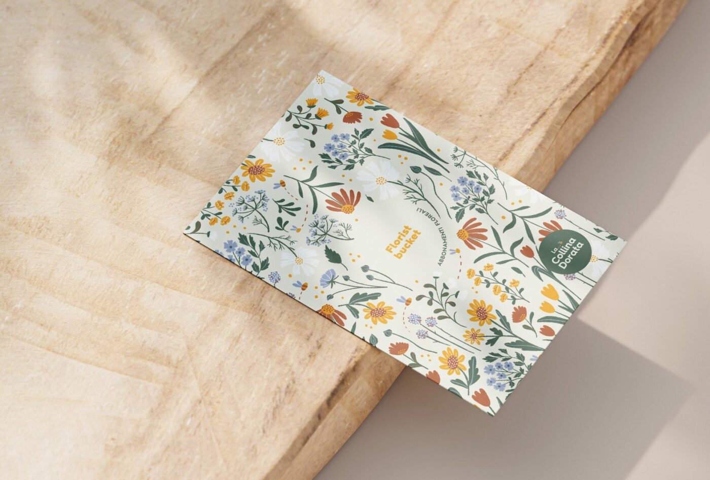
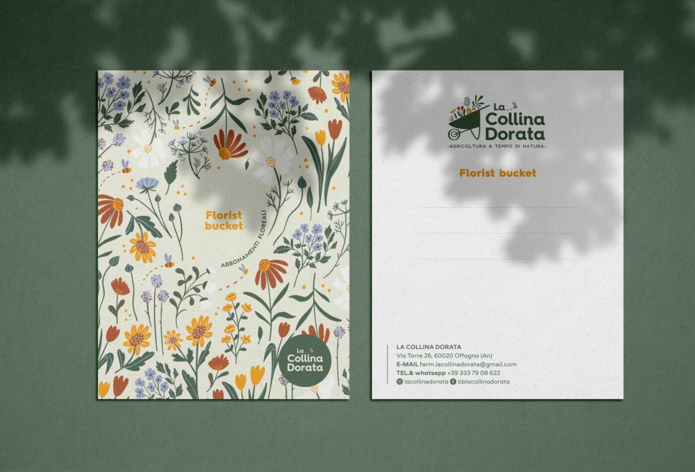
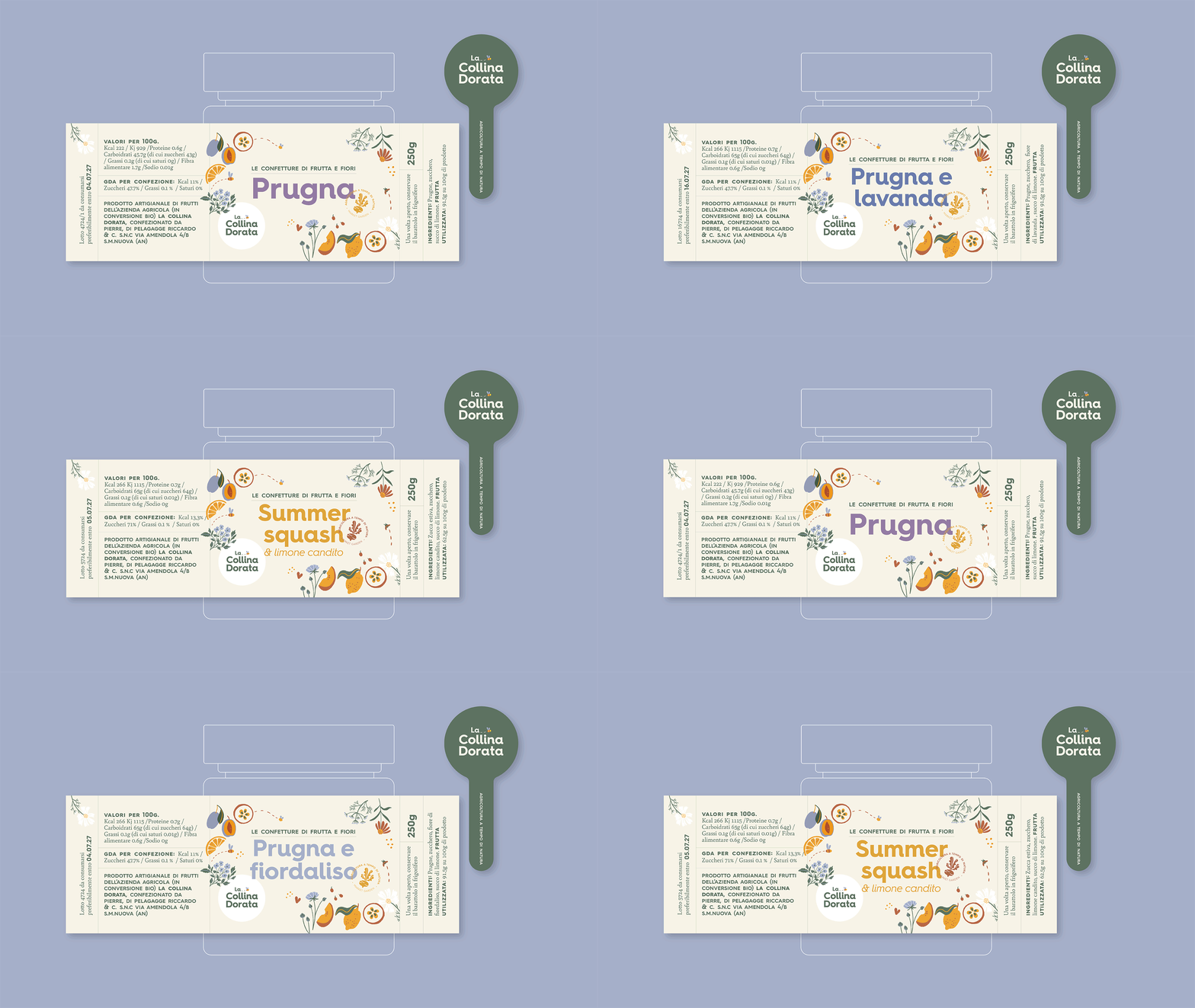
La collina dorata
Brand identity for the new Market Garden
"Is it possible to create a small-scale business model that is fair for the people and sustainable for the environment?"
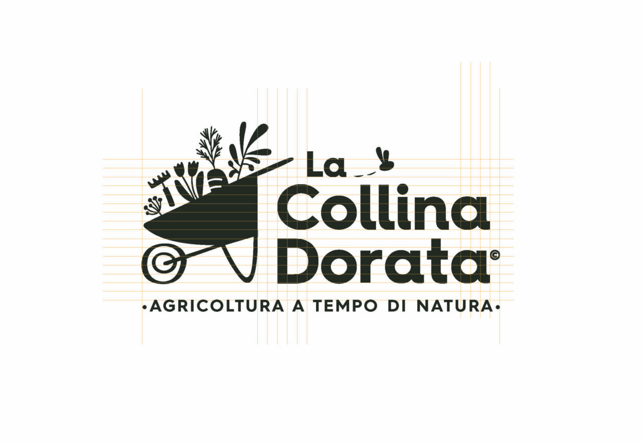
La Collina Dorata is a Market Garden project in the Marche Italian Region where production is focused on seasonal, regenerative, and organic methods.
In 2022, the Italian-English family consisting of Owen, Eleonora, little Aurelio, along with their dog Ralph, left the United Kingdom to realize their dream in Italy: to offer good and environmentally friendly food, thanks to slow and conscious cultivation.
In their flourishing garden, flowers grow abundantly, taking their time to develop, while also offering a sensory experience that heals the soul.
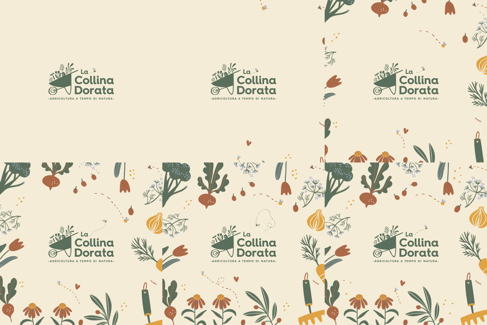
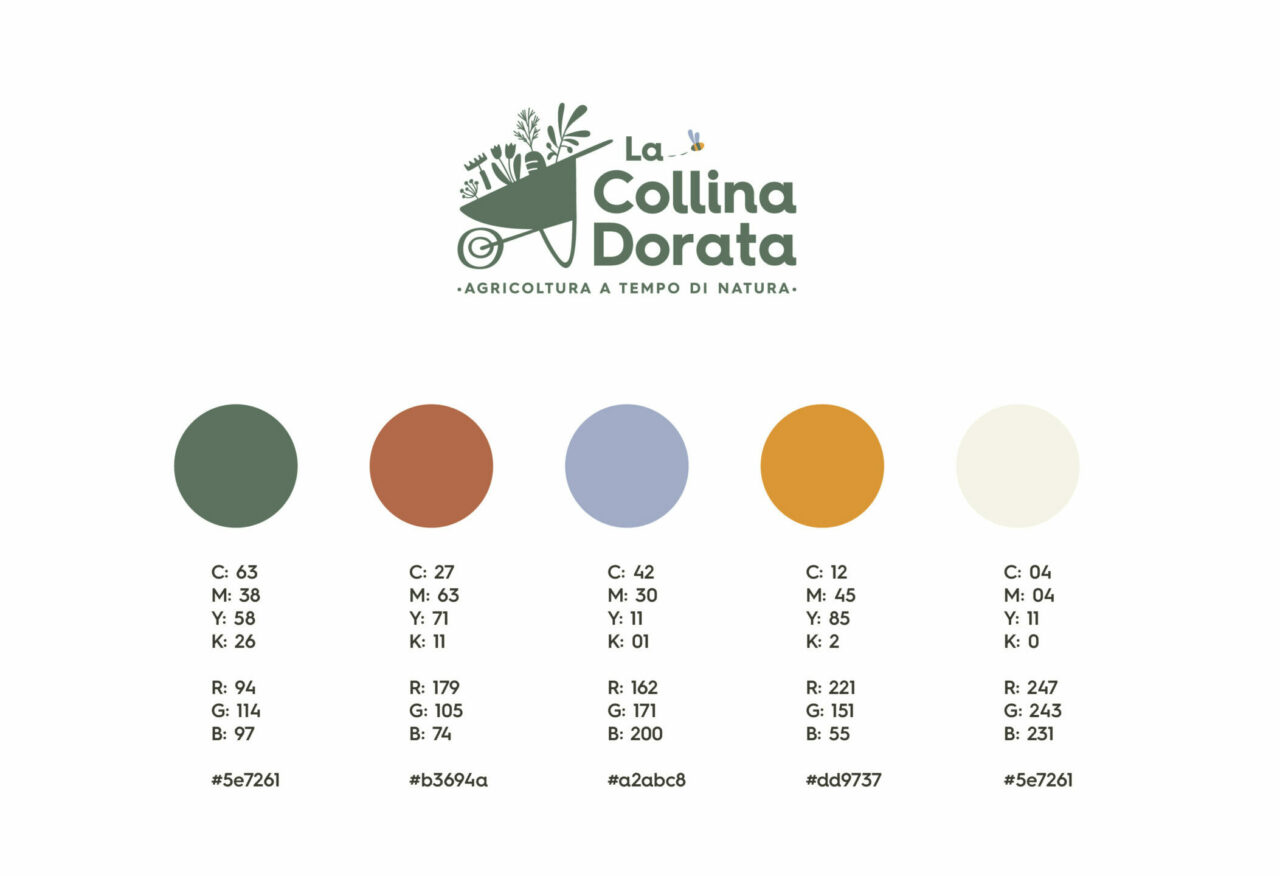
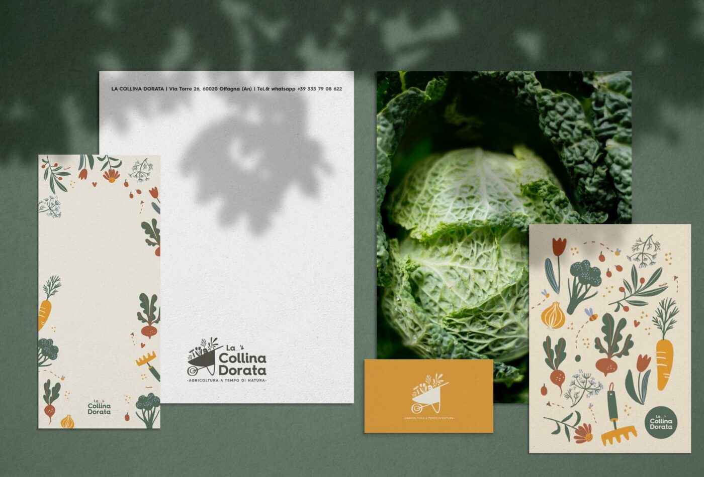
A strong brand identity has been developed to embody the company’s core values:
living slowly in contact with nature
manual work that requires care and attention
love for the territory and biodiversity
hospitality and genuineness in relationship with people
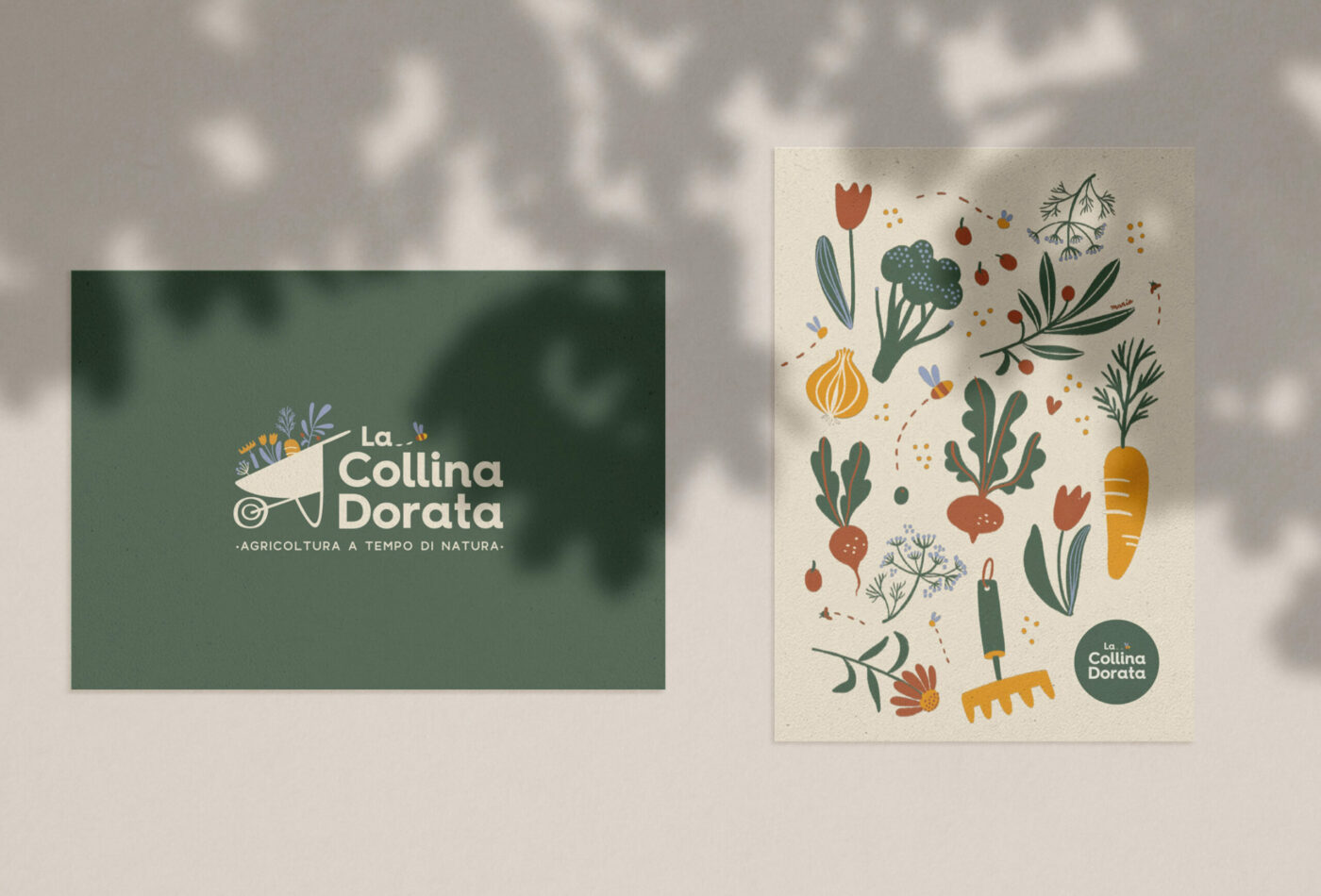
Every element of the visual identity aims to be a reminder of the beauty of outdoor life, attention to detail, and the passion for doing the work one loves
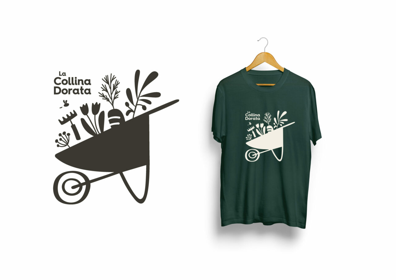
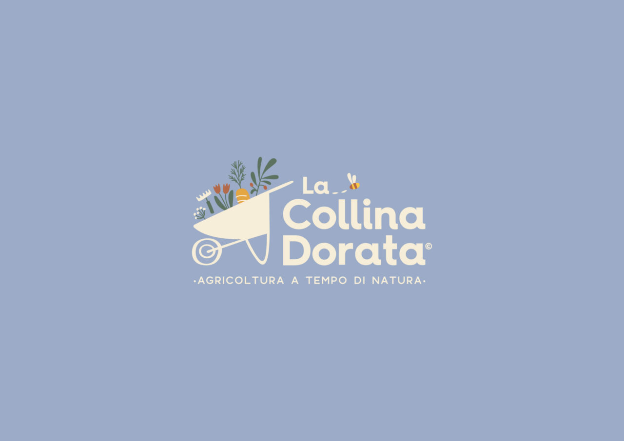
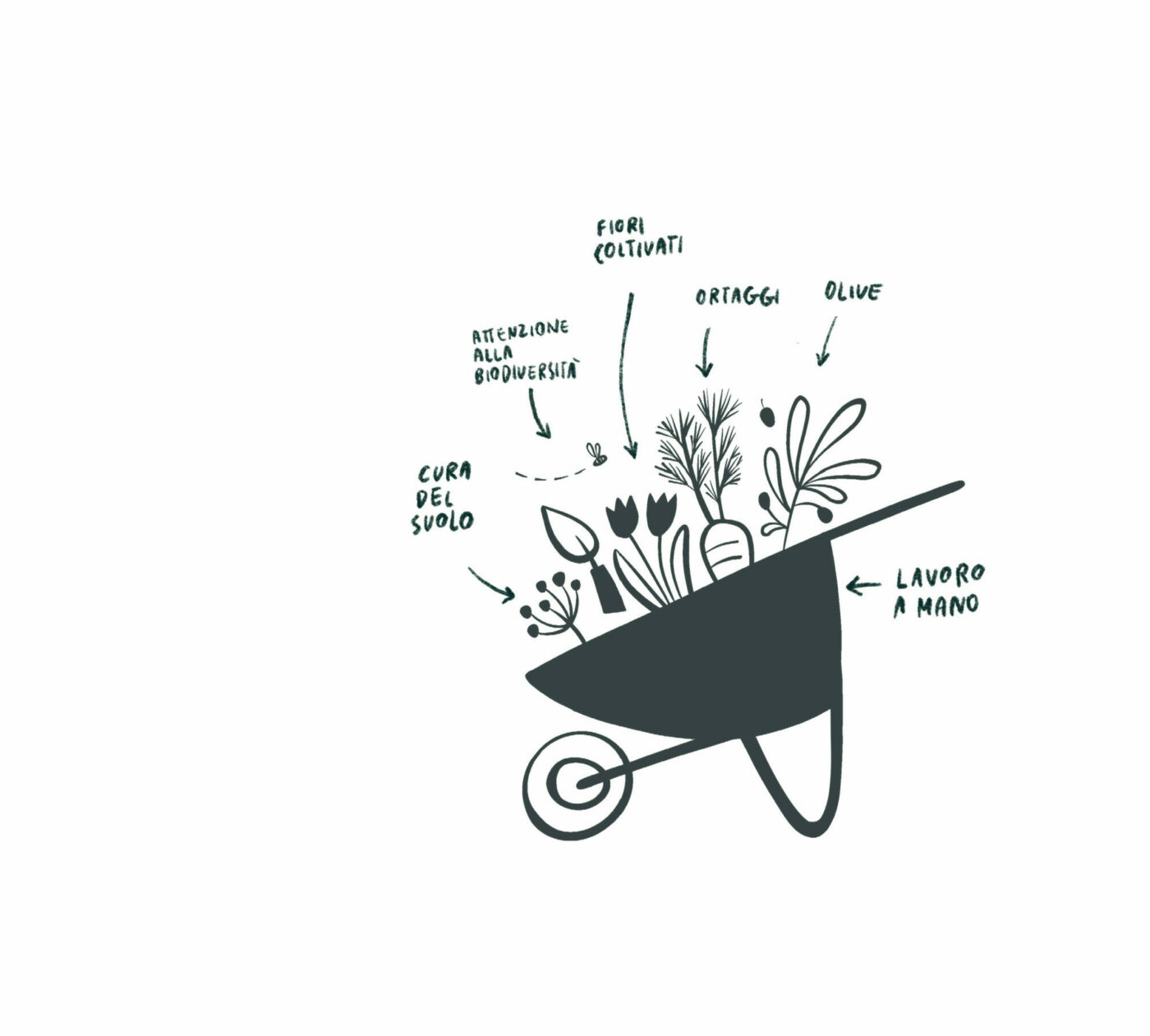
The illustrated icon is composed of 5 elements that represent the types of cultivation in LaCollina Dorata and the wildest part of the territory that surrounds them: cultivated flowers, vegetables, olives, local flora and fauna.
Graphic Design: Maria Marega Customer: La Collina Dorata Year: 2022/2024