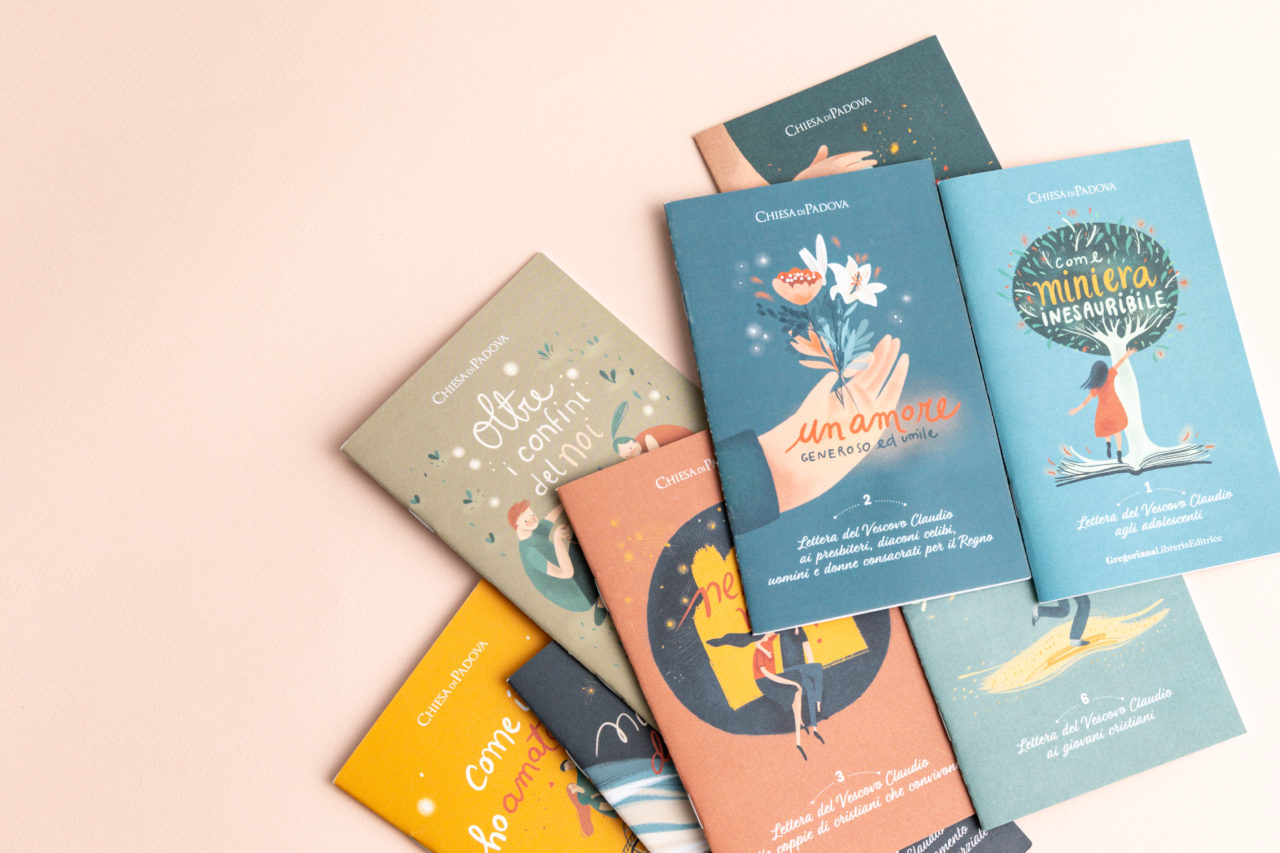
During 2018, the Padua Bishop, Claudio Cipolla, wrote 10 letters to his diocese Christians to present different family topics.
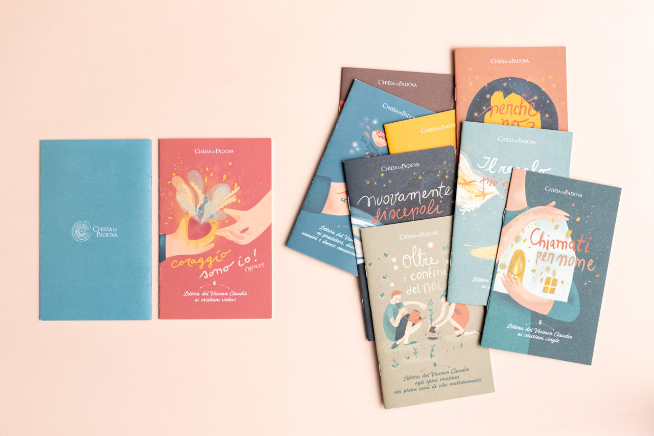
Each letter is addressed to a different category: young people, adolescents, engaged couples, married couples, separated couples, widowers, and others.
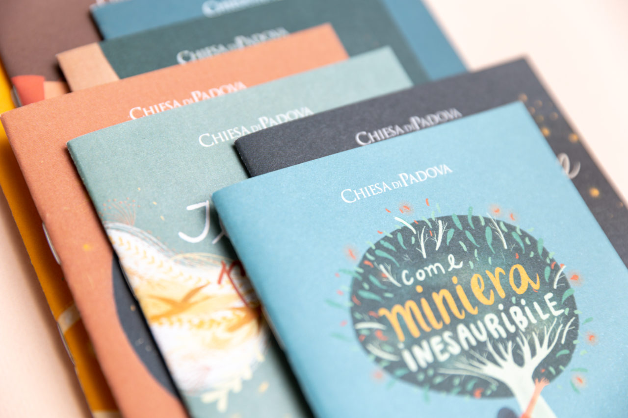
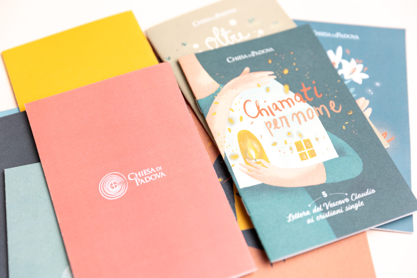
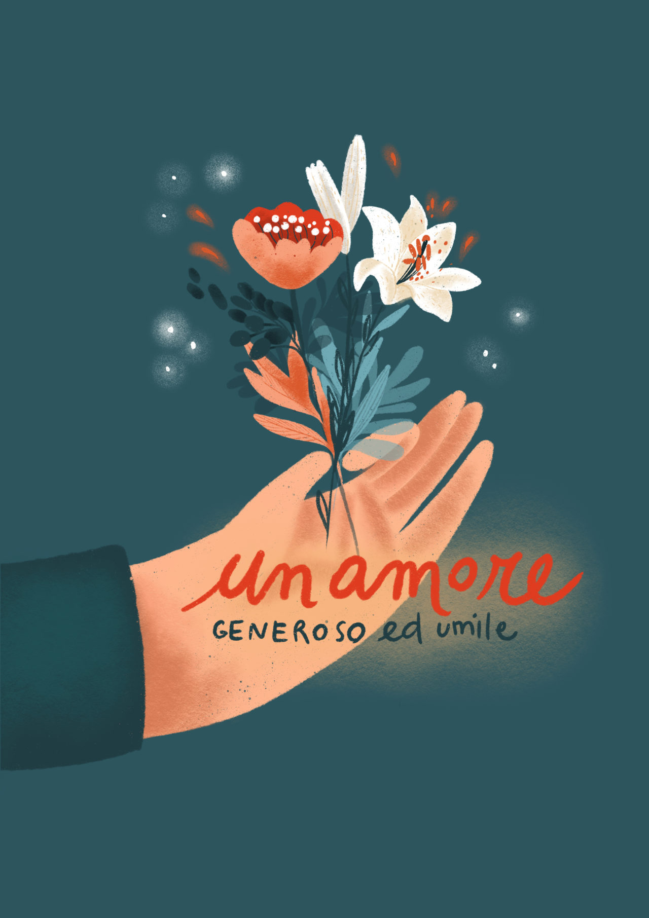
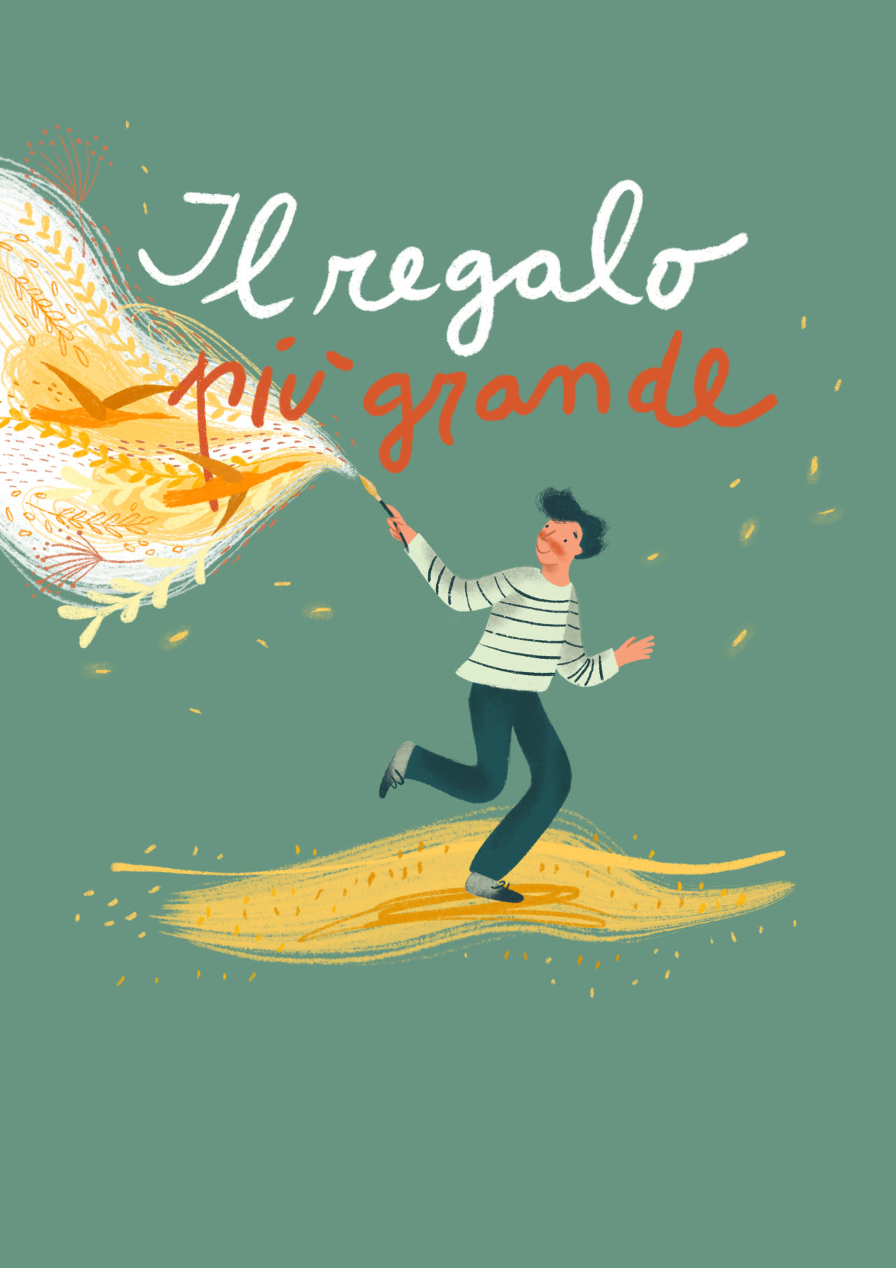
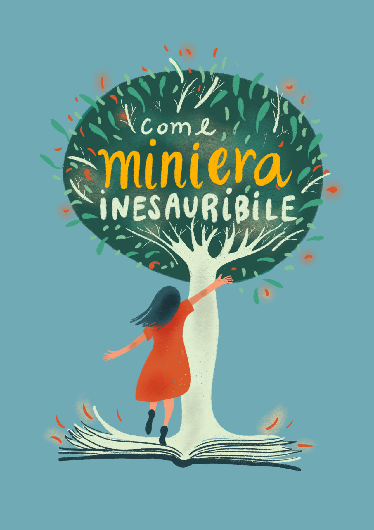
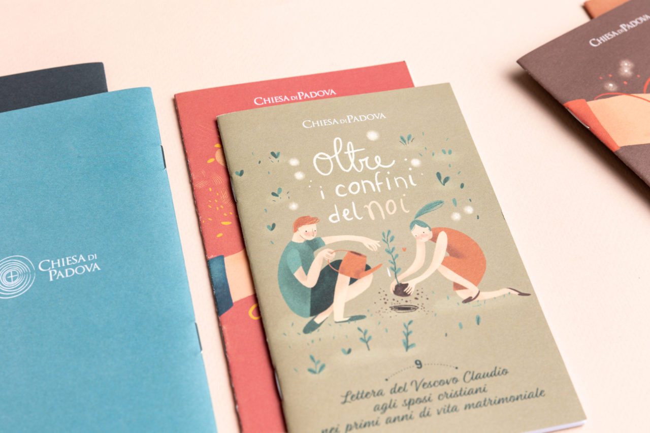
I designed and illustrated 10 covers for the letters written by Bishop Claudio Cipolla. The project, commissioned by Padua Diocese, has been published into 10 small books.
The images were developed to be linked together by a fil rouge: they share the same style and a common palette composed by energetic and bright colours. Each cover has a different background.
The cover titles were written by me using a unique hand lettering font, combining the illustrated images to better highlight the publication themes.
Illustrations and Art direction: Maria Marega Graphic Design: Elena Fiorenzato Customer: CHIESA DI PADOVA – Diocesan Office for Family Pastoral Care Year: 2018
#illustration #packaging #handlettering
Gli infusi del bosco
Packaging illustrati limited edition
Well-being moments in the forest enchanting atmosphere.
A journey into the woods with flavours and illustrated patterns.
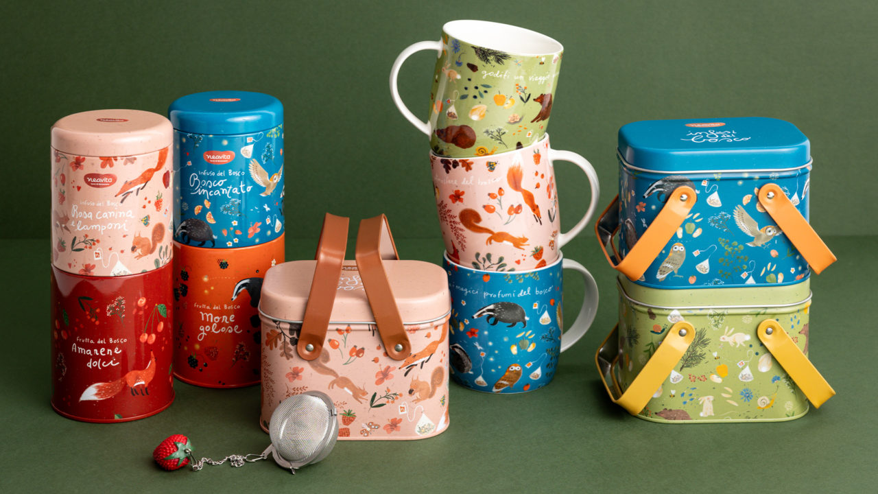
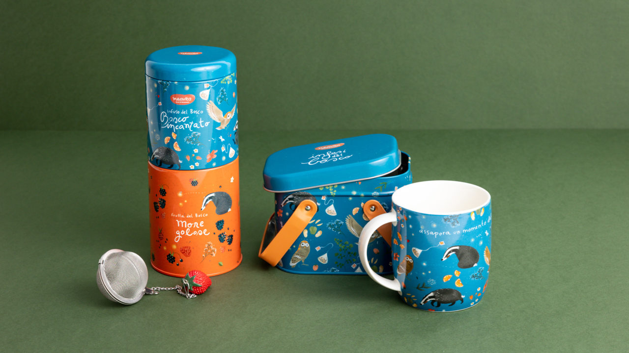
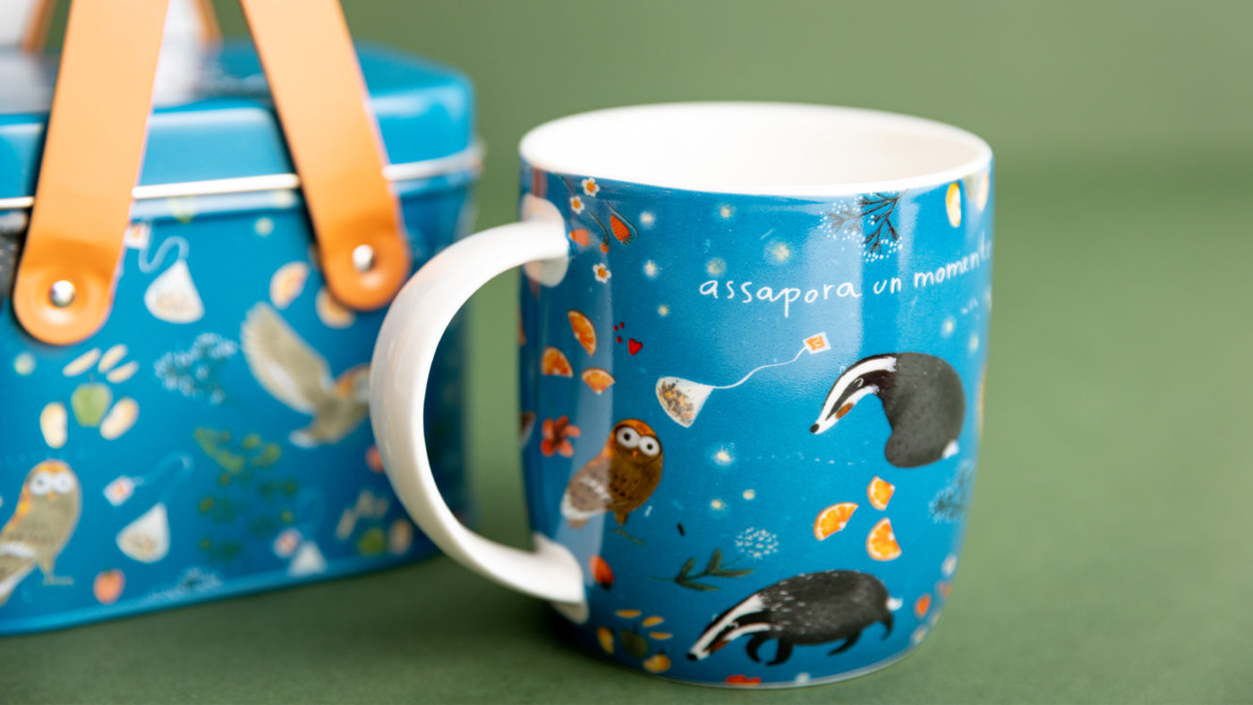
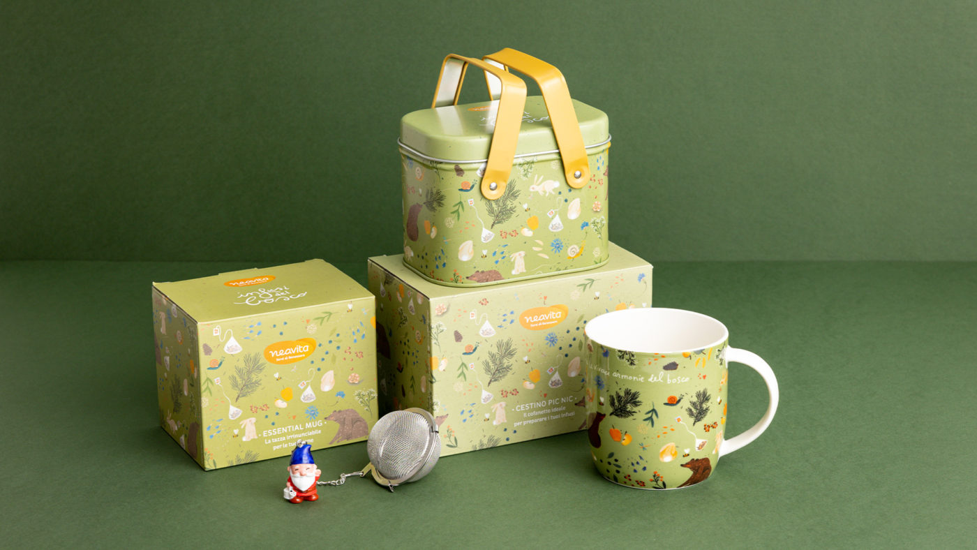
For the herbal tea company Neavita.it I designed three illustrated concepts with three different infusions. The products were sold in limited series in Winter 2021.
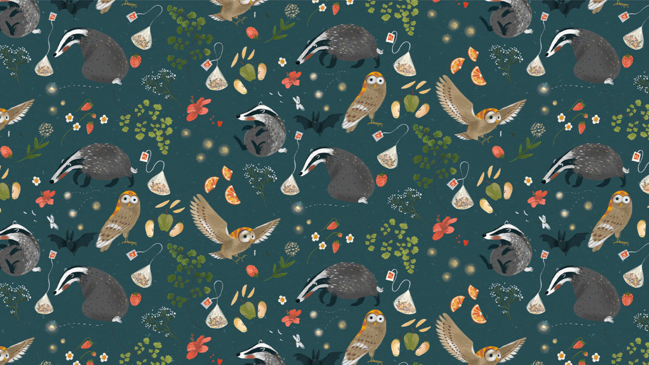
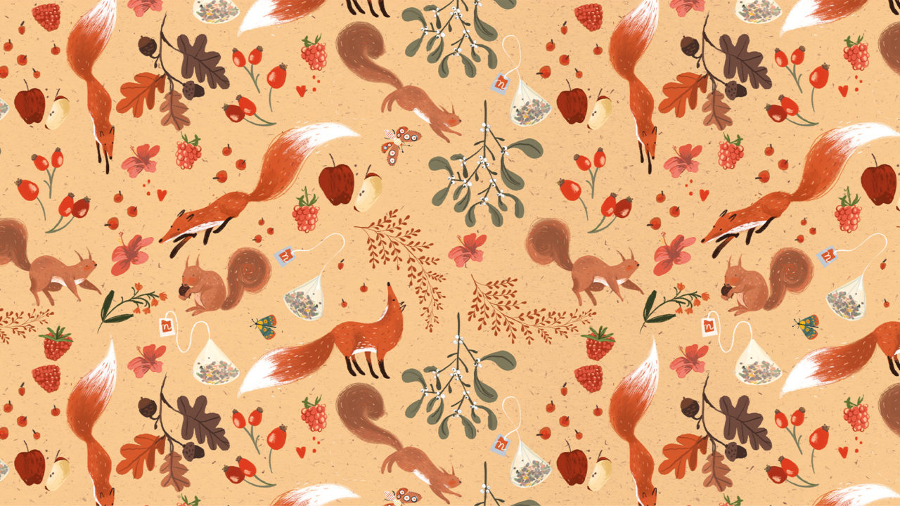
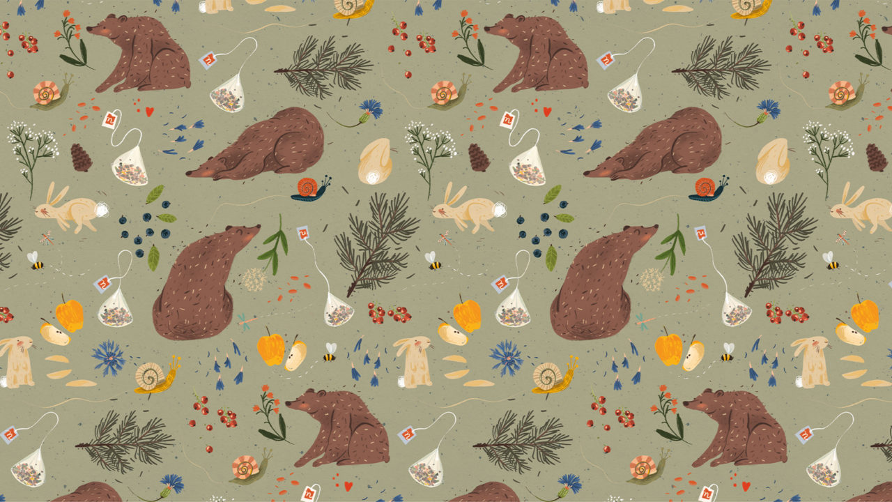
A colour palette was chosen for better differentiate three different infusion products: Rosa Canina and Lamponi, Enchanted Forest, Ribes and Blueberries; colours were selected to evoke forest atmosphere.
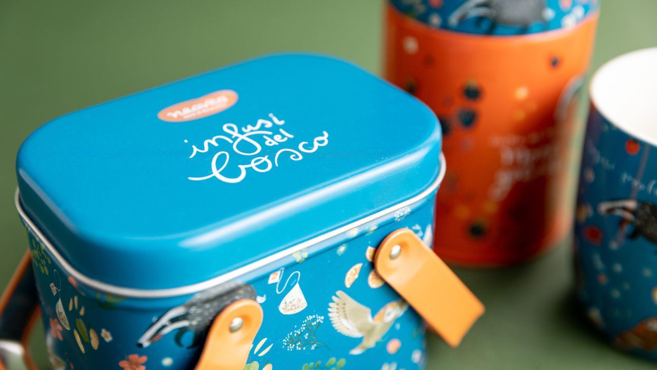
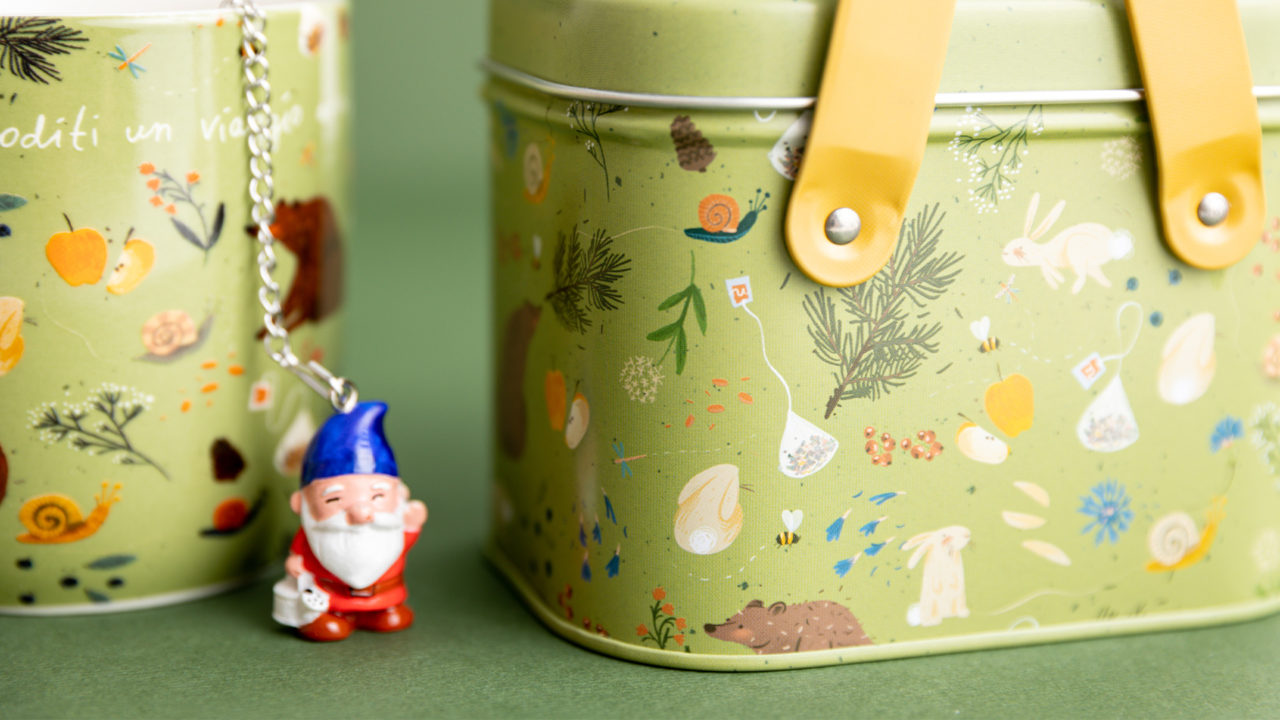
The patterns include different elements: the ingredients that make the infusions, animals and plants from the forest, a small claim in hand lettering. Illustrations were made with digital technique.
Harmonic and replicable compositions were developed to be inserted within different supports: ceramic mug, tin “picnic basket”, cardboard box, metal “duo” box.
Illustrations, Lettering and graphic design: Maria Marega
Art direction: Manuel Rigo, Luca Emanuele Simonato
Render and execution: Opificio Lamantini Anonimi
Customer: HP Italia srl – Neavita
Year: 2020 – 2021
#brandidentity #graphicdesign
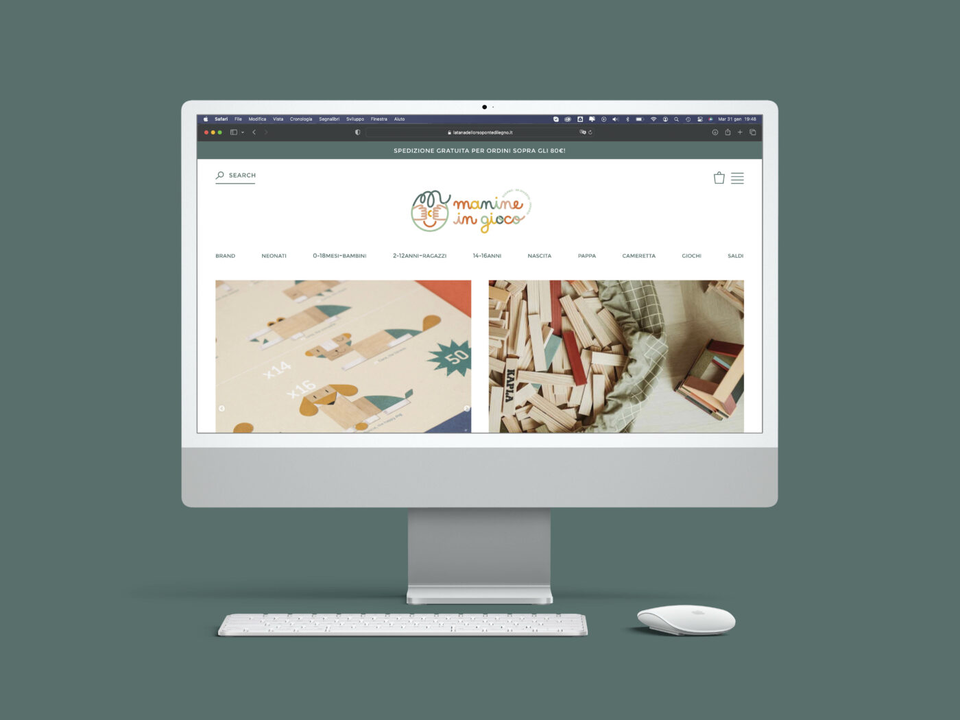
MANINE IN GIOCO
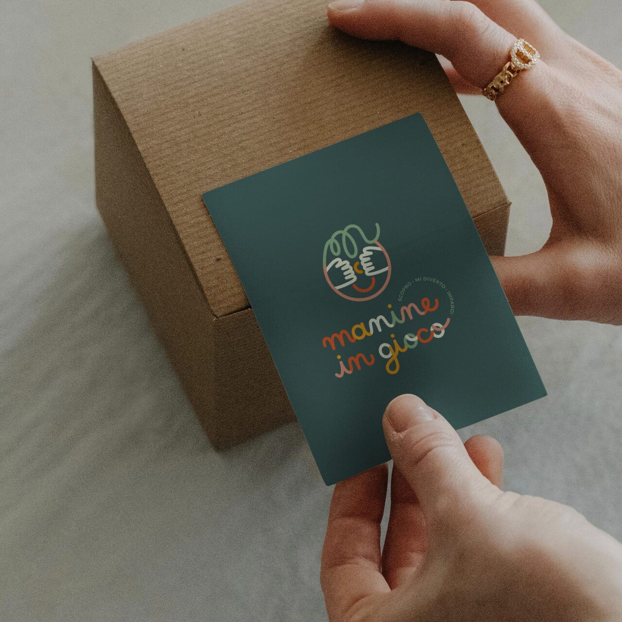
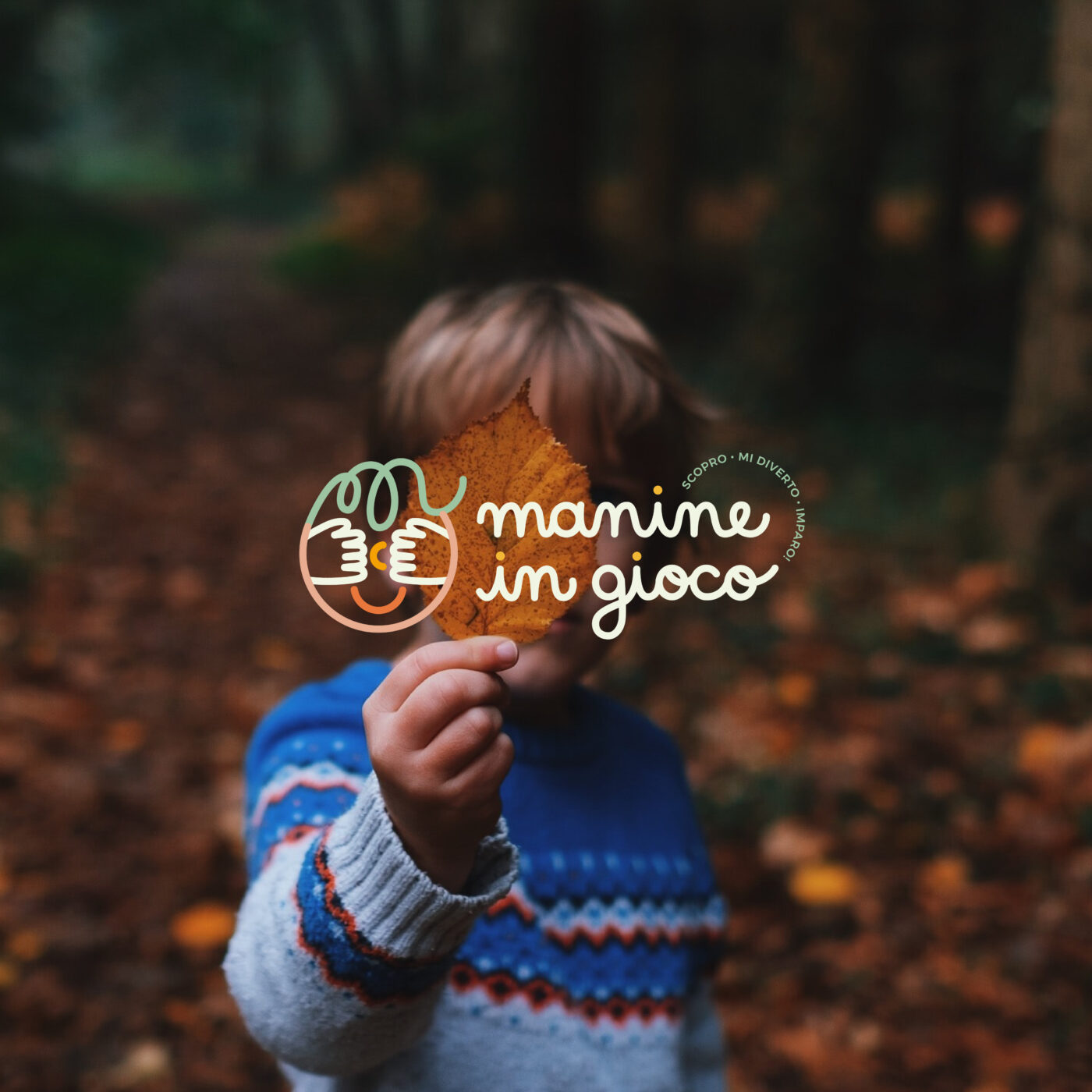
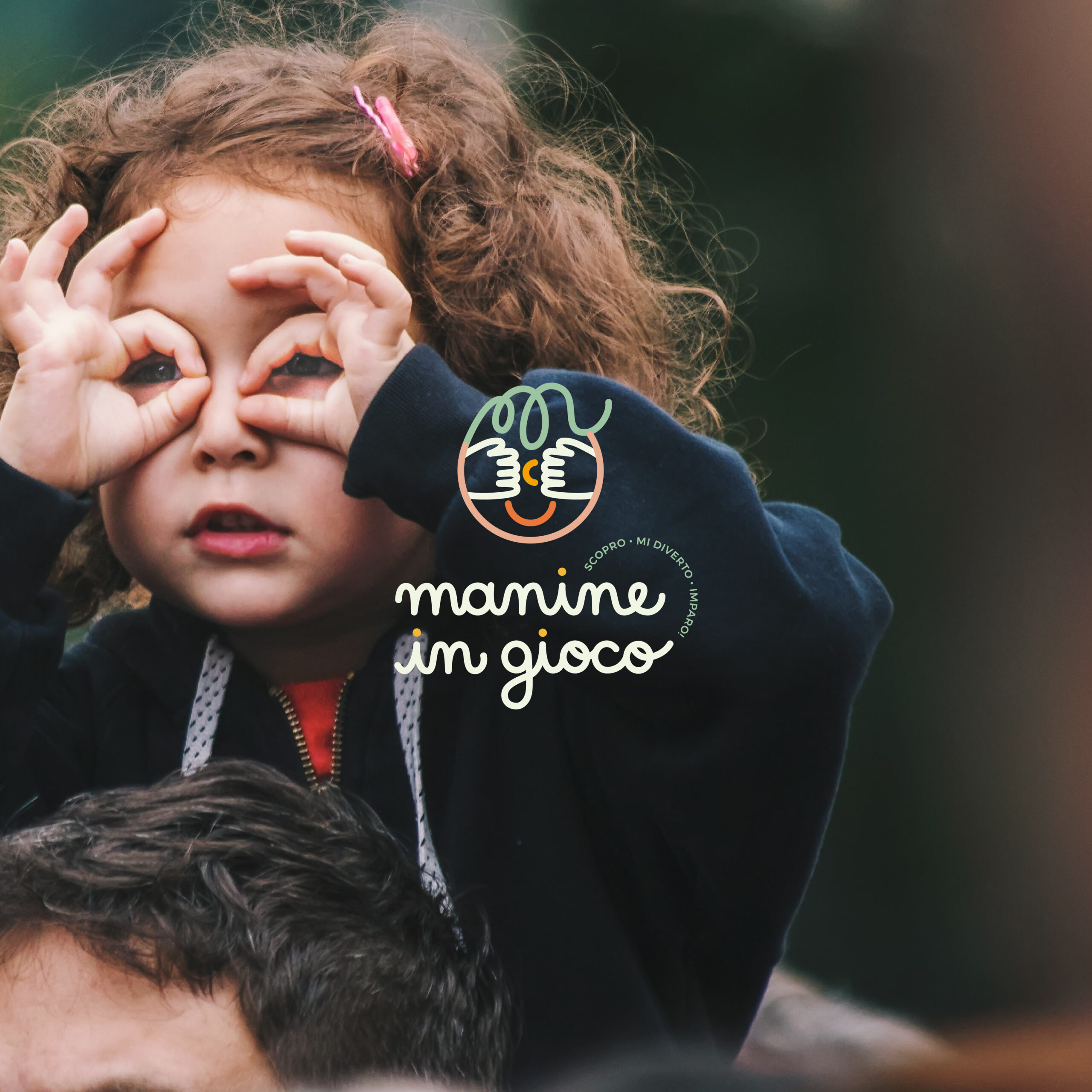
Logo and brand identity for a new children's online store
"Have you ever observed children in their moments of discovery? "The curiosity, the wonder, the engagement, the concentration that bloom in these moments, grant to us viewers the enchantment; time seems to be magically suspended."
Manine in Gioco aspires to be more than just a toy store. The aim is to create a hub where people can exchange innovative tools and ideas.
The e-commerce platform offers a wide range of educational materials, toys, children’s books, and reference books. Each brand is meticulously chosen to guarantee the highest standards.
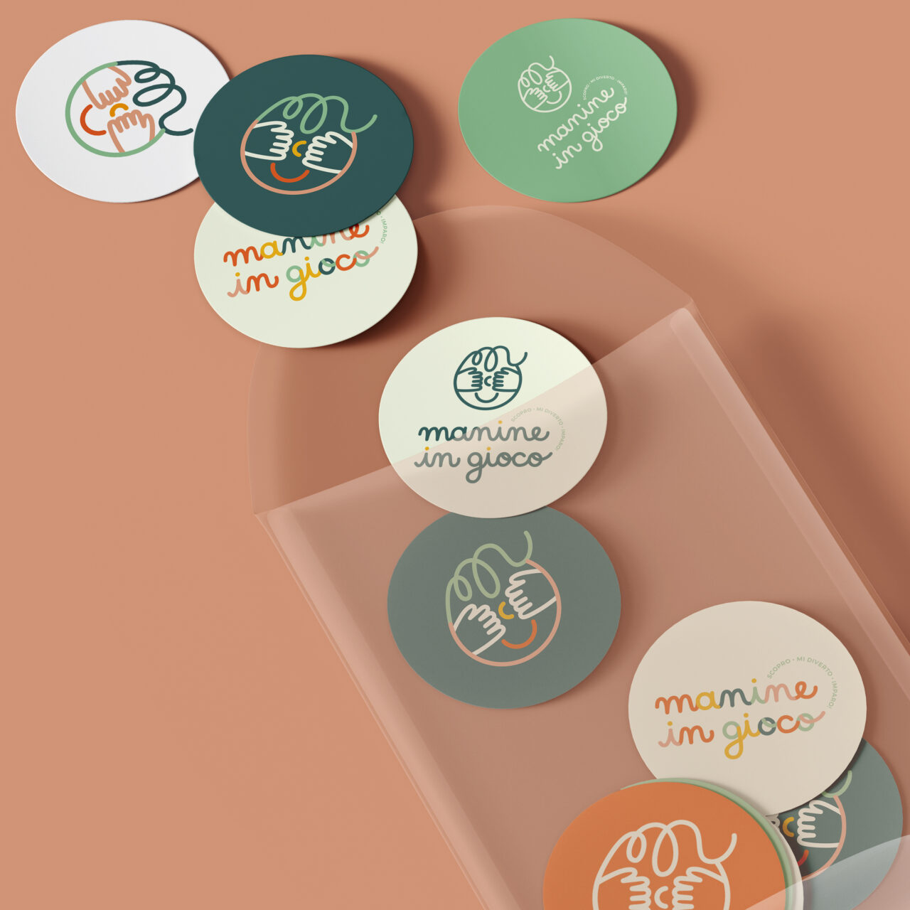
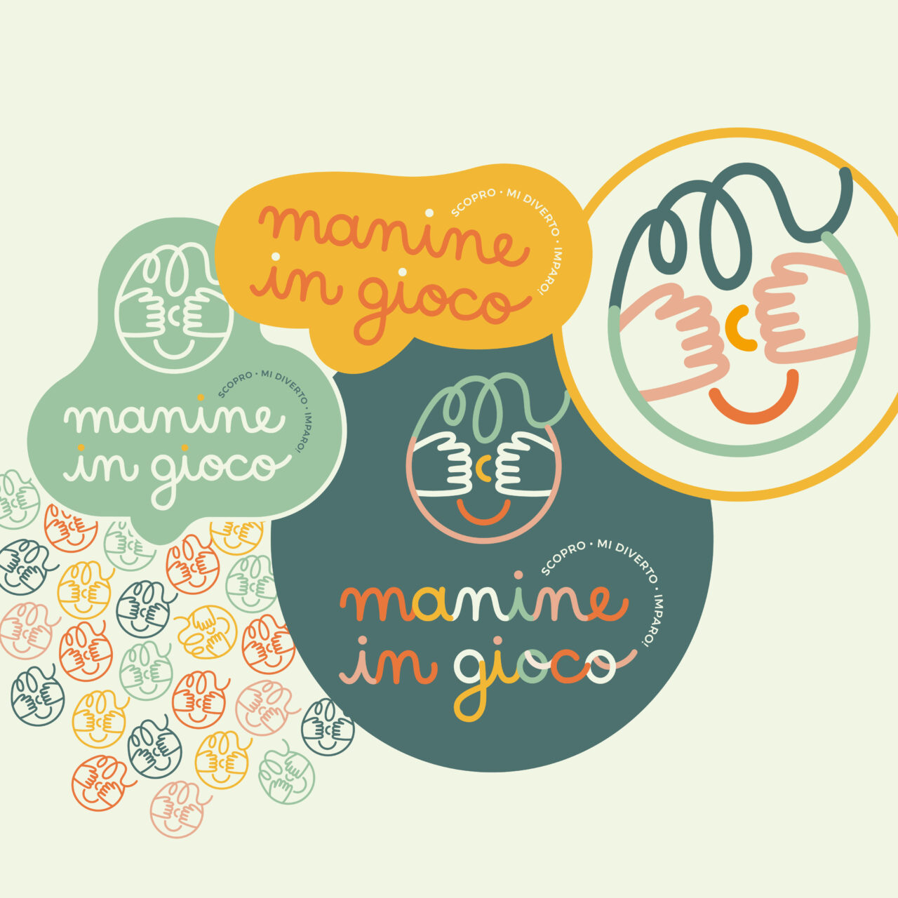
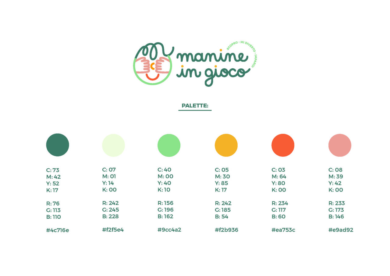
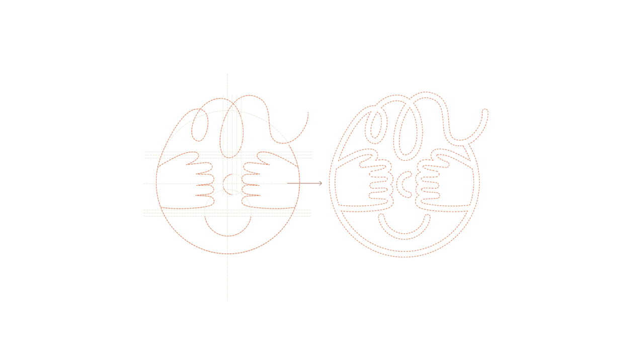
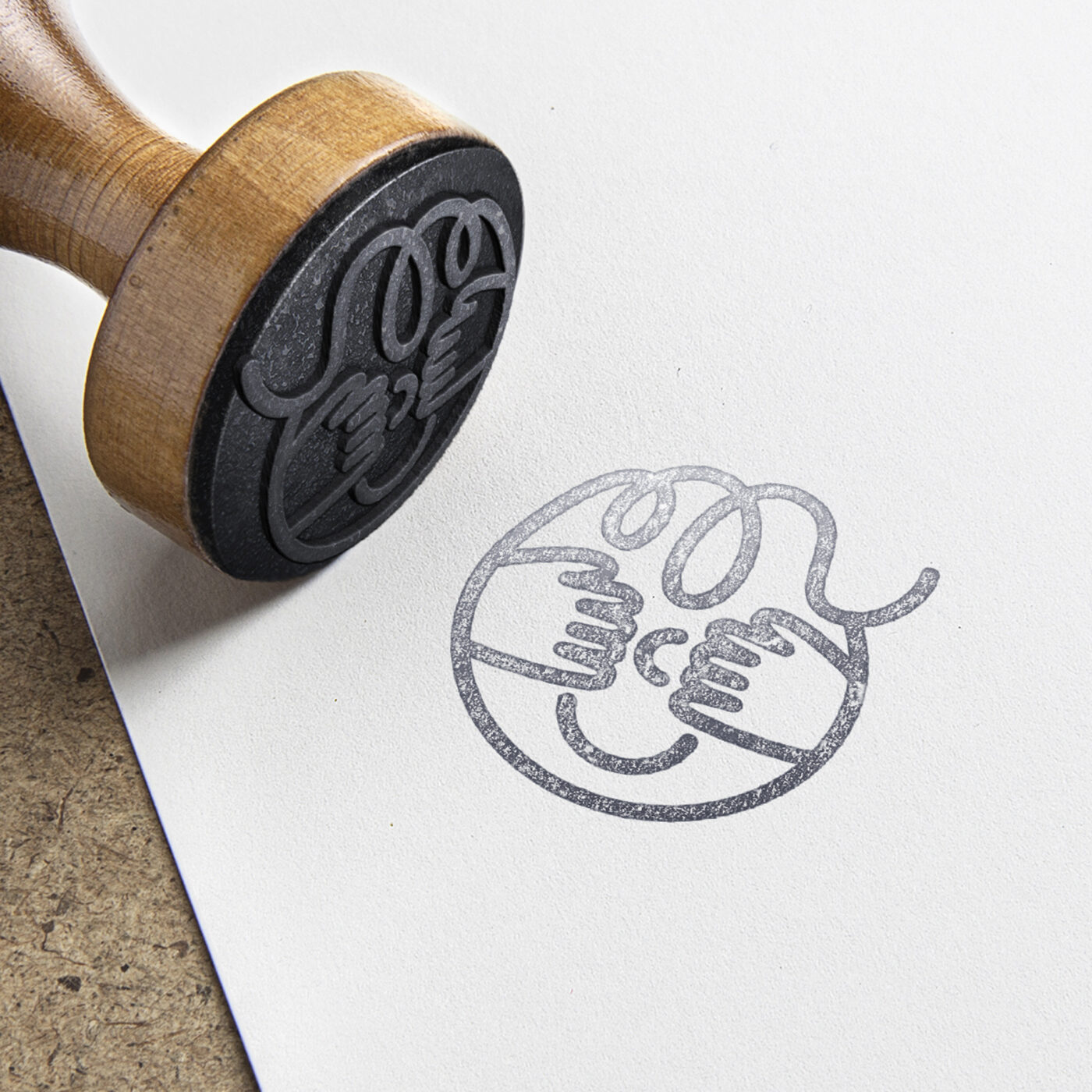
During the brand identity study of Manine in Gioco, it was essential to communicate these values. The logo needed to embody a space where one could find kindness, care, quality, but also playfulness and fun!
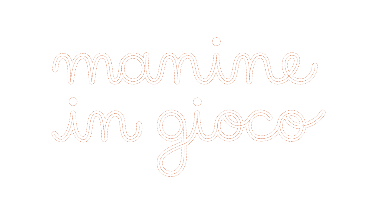
Every aspect, from the color palette to the personalized typography and icon, were thoroughly studied to be beautiful, elegant, and well-crafted, just like the spirit of this store.
"Why Manine in Gioco? Because it is specifically through their hands that children experience and bring to life their feelings, learnings, understandings, and explorations... Hands serve as the primary pathway to actively comprehend and engage with the world."
Lettering and graphic design: Maria Marega Customer: Manine in Gioco Year: 2022